Wine Bottles, Olive Oil and the Long Game of Packaging Seduction
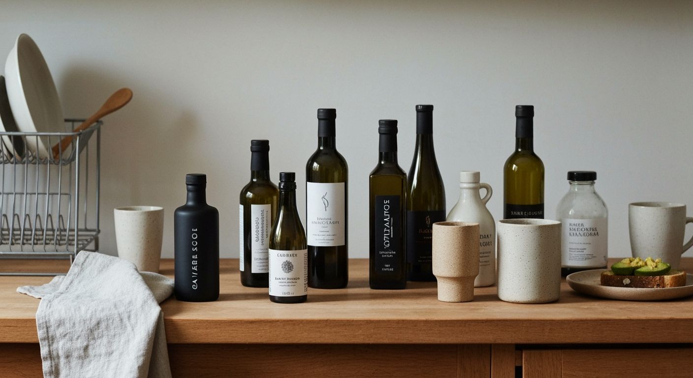
There’s a reason those boutique olive oil bottles at Farro are shaped like they belong on an architect’s shelf, not a pantry. It’s not accidental. It’s packaging-as-siren-song, design doing its best impersonation of desire. I’ve spent the last two weeks lining up household brands on the kitchen bench like suspects in a Scandinavian police procedural, trying to decode what makes a bottle whisper 'premium' before you’ve even popped the lid.
The answer, strangely, is tone. Not colour or label size. Tone. That elusive blend of restraint and confidence. The really good ones speak with the kind of casual fluency that lets you know they know. They skim past the need for loud claims or QR codes. There’s a physics to it, too. Heavier glass. Shorter neck. A wider base that says, ‘You’ll want to keep me on the bench, not hide me in the cupboard’. I’m convinced some of these producers have spent more time sourcing the perfect bottle than concocting what goes inside. And that’s not a criticism.
This isn't just food styling. It's slow-burn branding. These products are playing the long game. The olive oil that looks like it belongs in a gallery starts to create emotional real estate in your kitchen. You remember it. You feel a bit more European when you drizzle it. It becomes part of your identity in that subtle, insidious, quite brilliant way good design does. And then, just like that, you’re loyal. You’re hooked.
We talk a lot in marketing circles about brand love, storytelling, experience design. But maybe the best brand move is making your product live rent-free on someone’s bench. Or shelf. Or bedside table, if you're into artisanal water. Either way, the game isn’t just what they buy. It’s where they leave it. And how long it keeps whispering to them.