Why the Best Packaging Is Lying on Your Nan's Pantry Shelf
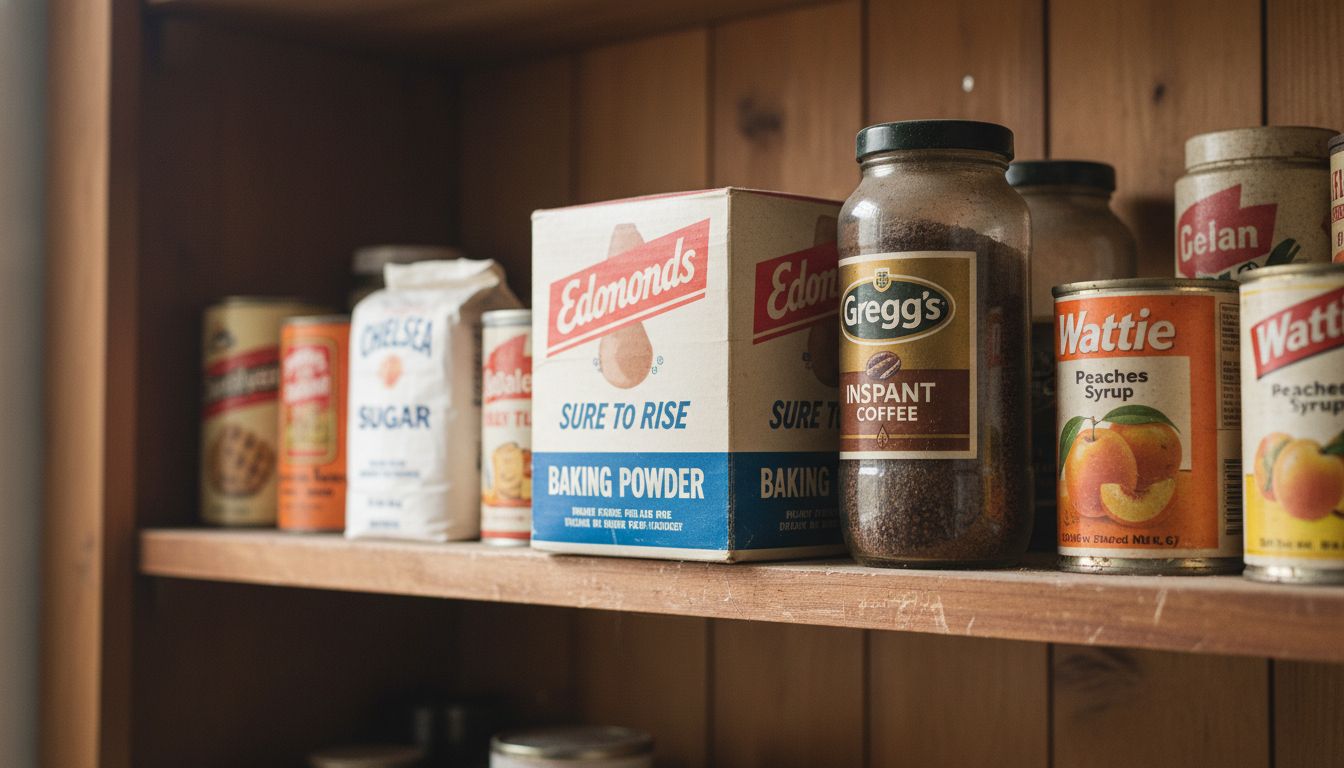
Spend 12 minutes in any Auckland organic supermarket and you'll find yourself lost in a pastel avalanche of oat milks, hole-punched label tags and hand-lettered tonic bottles that promise vitality, clarity and possibly eternal youth. It’s like an Etsy baby shower exploded. But travel 20 minutes north, open your grandmother’s pantry, and there it is: the clean, confident design of 1980s Gregg’s coffee jars and Edmonds baking powder tins. No gradients. No clever puns. Just a quiet authority that stares you down and wins.
This isn’t nostalgia-for-nostalgia’s-sake. It’s functional design with something almost extinct in today’s branding: conviction. Back then, products didn’t whisper. They declared. They didn't try to be your friend or your therapist. They told you what they were, who made them, and that they’ve always been here. In a world filled with ephemeral DTC brands scrambling to be liked, there is something oddly radical about that kind of certainty.
The design equivalent today would be something like Fix & Fogg. They’re smart. They use colour well. But crucially, they commit. Their peanut butter doesn’t perform. It just is. The line between timeless design and self-conscious mimicry is blade-thin, and you can see who’s walking it. Too many new brands dress like heritage brands without the confidence to act like them.
If agencies and marketers want real cut-through, maybe they need to stop testing everything into beige. Let a product just... be. It’s not always about delight or disruption. Sometimes it's about a quietly good jar of jam that your dad has bought for 40 years, and reckons is still “a bloody good jam.” That sort of trust? You can’t brief that into a campaign.