Why Everyone Is Suddenly Designing Like It's 1993
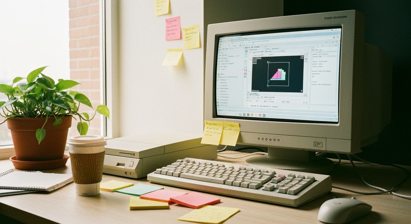
There's a 24-year-old designer in Christchurch who just discovered Windows 95 graphics. And she’s not alone. From Wellington startups to ad agencies in Ponsonby, pixelation is having a moment. It’s not nostalgic, it’s biblical. Designers are digging up GIF fossils, dusting them off, and giving them display budgets.
The question isn’t why it’s back, but why it works. Skeuomorphism had its grave stomped on years ago, but we’re seeing its ghost in pixelated drop shadows and clunky cursor animations. The rawness of it almost feels rebellious. In a saturation of slick and sterile, a bit of chunky anti-perfection sells authenticity. And here’s the kicker: a generation too young to remember dial-up thinks this stuff hums. They’re remixing vintage without irony.
Brands are cautiously sipping from the same glitchy Kool-Aid. I spotted a campaign last week from a very uptight bank that used a looping 8-bit piggy bank. That’s not nothing. When the institutions start glitching, you know we hit a cultural nerve. This isn’t a gimmick, it’s an aesthetic revolt. Texture is back. The digital world grew up too clean, and now the lint is fashionable.
Will it last? Like all visual revolutions, probably not. But something about this one feels different. It’s not just about what it looks like, it’s what it rejects: default gradients, invisible grids, and boards of directors who ask to “make it pop.” So go ahead. Make it pop... with 16 colours and a resolution you can count on your fingers.