The Menu That Makes You Stay: Why Restaurant UX Is Better Than Yours
A funny thing happened while I was ordering dumplings.
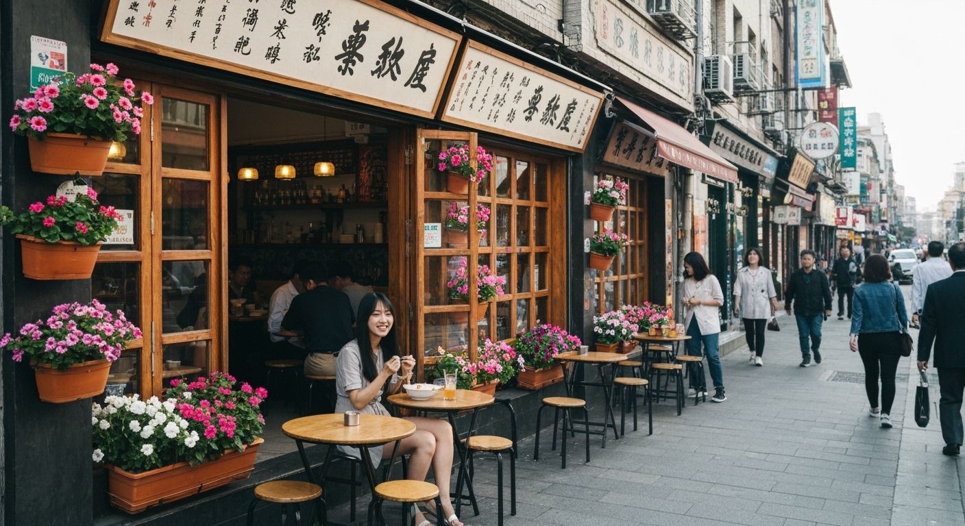
I found myself lingering on a laminated menu at a tiny Sichuan joint in Mount Roskill. Minimal visuals, yes. But that layout—strategically chaotic—had me reading every single line. My eyes flicked from spicy tripe to cold cucumber with sesame, and despite knowing exactly what I wanted before walking in (dumplings, obviously), I ordered five extras. Five. Not because I needed variety. But because the menu was doing something your website probably isn’t.
We talk a lot about UI in digital spaces, but we don’t apply nearly the same reverence to offline UX. A good menu, especially the slightly overstimulating kind, uses pacing and psychology like a pro. It knows when to overstuff you with options, when to add a sense of scarcity, and when to seduce you with a buried gem (hello, cold seaweed salad at the bottom right corner in a smaller font). That’s not a design flaw. That’s choreography.
Here’s the kicker. These little eateries, many of them family-run, aren’t hiring UX consultants. They’re drawing on decades of instinct and fine-tuning through real-time trial and error. Meanwhile, your slick mega-brand homepage with two lonely CTAs and all that whitespace feels flatter than the prawn cracker in my coat pocket. Maybe you don’t need a redesign. Maybe you just need the menu guy from Mt Roskill.