Local Agency Launches Revolutionary New Font Named ‘Briefing Sans’ to Reduce Client Expectations by 27%
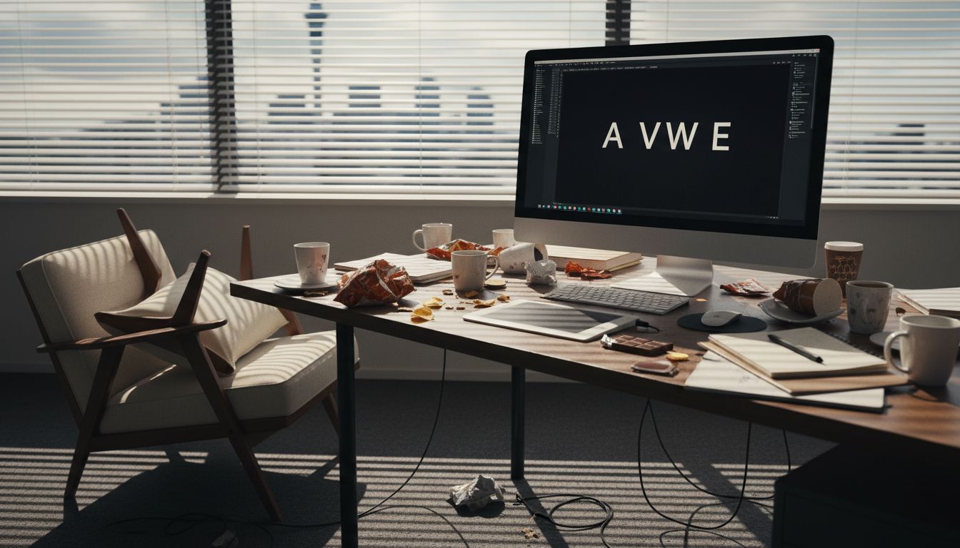
AUCKLAND, Monday — In what it's calling a "bold stride toward mediocrity," leading creative agency UpperCusp has unveiled its latest product: a proprietary typeface specifically engineered to lower client expectations from the moment the pitch deck opens. Dubbed 'Briefing Sans,' the font has already been rolled out across all internal docs, mood boards, and coffee signage.
“We noticed that clients became irrationally excited when we used Helvetica Neue,” said UpperCusp’s Head of Strategy, Calvin Properly, who spoke exclusively while eating a croissant off a branded clipboard. “Briefing Sans dials that madness down. No unnecessary optimism, just pure, measured neutrality with a hint of creative fatigue.”
Developed in partnership with a freelance typographer-turned-drummer from Grey Lynn, the typeface is a loosely kerned sans-serif with passive-aggressive ligatures. Its lowercase 'g' has been specifically designed to resemble a panicked junior exec. “Even the punctuation apologises,” explained Properly. “The question mark actually whispers.”
To further temper enthusiasm, the font file weighs 718MB and only renders correctly on devices last updated in 2019. “We’re future-proofing by staying several years behind,” says UpperCusp’s junior innovation officer, who was hired last Tuesday and already has two performance reviews.
Early trials show a 27% drop in clients asking for ‘just one more tweak’ and a 92% increase in confused silence. Briefing Sans will be made available to agencies that promise not to use it for manifestos or award entries. Especially not award entries.