Why Every Craft Brewery Has the Same Poster, and What That Says About Us
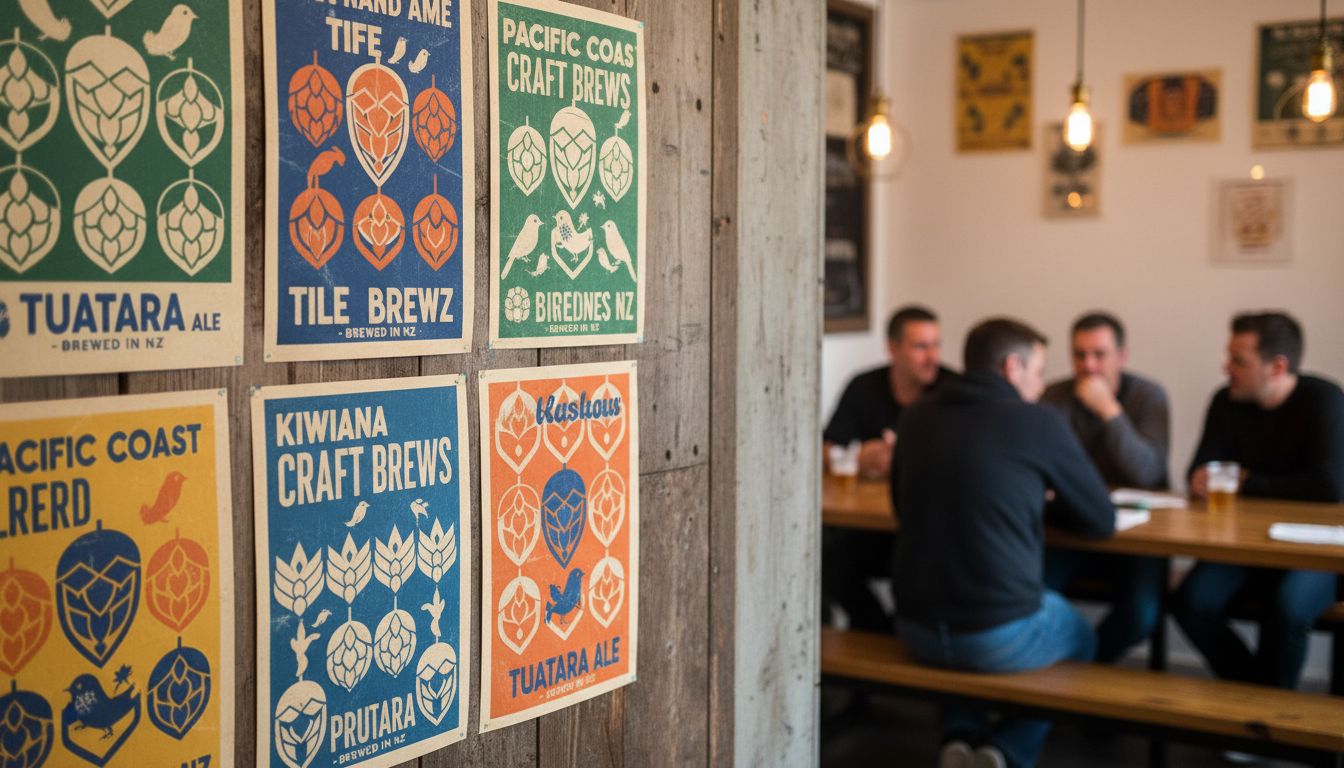
Walk into any indie craft brewery from Dunedin to Devonport and you’ll be met with great beer and, oddly enough, the same poster. Picture it: geometric hops, distressed textures, maybe a moody bird silhouette thrown in for craft cred. It’s not bad design. It’s just... everywhere. We’ve hit peak cliché IPA.
And yet, I can’t stop staring at these posters. I went down a rabbit hole. Turns out, most of them stem from a handful of overused templates floating through online marketplaces. Designers tweak a few colours, slap on a microbrew name with a pun, and call it a day. The aim is to look handcrafted without actually crafting anything. It’s the artisanal version of clip art.
Here’s the twist. Customers love it. The familiarity reassures them they’re in a spot that meets expectations: hip, slightly ironic, full of flavour. In a way, these visuals build trust through creative sameness. That’s smart marketing, but also a weird kind of aesthetic groupthink. Somewhere along the way, different brands adopted the same visual language to stand apart—and now they blend together.
What excites me is not ditching the motif, but pushing the why. What if breweries treated their design like they treat their beer—playful, experimental, occasionally weird? I'd love to see a pilsner with a poster inspired by 70s sci-fi paperbacks, or a sour with branding that looks like a Dunedin zine from 1998. We’ve tasted bold. Let’s start seeing it too.