How the Colour Yellow Hijacked Every Cafe Menu in Auckland
Walk into any vaguely hip cafe across Auckland right now and squint slightly. That menu board? It’s probably yellow. Pale mustard, canary, turmeric-infused – pick your Pantone. Once the domain of highlighters and road signage, yellow has elbowed its way into lattes and toasties. Why? Because marketing psychology won the battle, again.
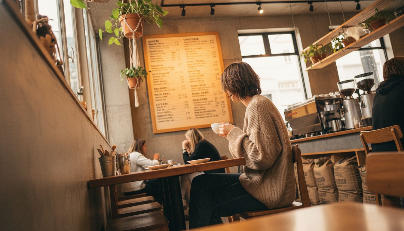
Yellow triggers hunger. This isn't new. Fast food chains have dined out on this theory for decades. But the cafe set took longer to catch on, wary of garish tones interrupting their aesthetic serenity. That patience has now spectacularly imploded. Suddenly everyone wants to tell you that their turmeric latte comes with microfoam AND an appetite cue baked into the background.
What’s clever here is less about the colour itself and more about who used it first. A café in Ponsonby painted their prices on banana-yellow tiles last winter. It was weirdly electric. People posted. Others copied. Now, you’ve got cafes pairing yolk-toned chalkboards with moodily lit interiors like it’s 2009 Tumblr all over again. The lesson? Design trends in hospitality aren’t born in studios, they spill across brunch tables and rack up likes.
There’s something quite funny about letting a pigment steer a marketing trend. But it's a savvy move. Yellow is memory-sticky. It says warm, sunny, fresh baked, even if your muffin is made from a packet mix. People don’t eat menus, but they remember how they felt ordering off one. Right now, they remember yellow. Give it six months and the new hue will arrive. I hope it’s something aggressively unpopular, like periwinkle.