The Strange Power of Beige Packaging
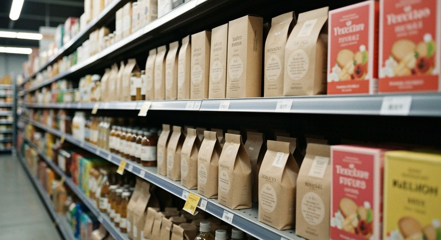
Somewhere between the fluorescent cereal aisle and the kombucha fridge, beige has wormed its way to the top of the design food chain. Beige, sand, oat milk, mushroom-spore brown. Call it what you will. Every boutique brand seems to have stripped back its packaging until it resembles a cardboard shipping carton with feelings.
This is not laziness. It is strategy. When a label commits to beige, it is performing an act of restraint. It is saying, we are too confident to shout in your face with neon. We will sit here quietly, serene and matte-finished, and you will lean in closer. Suddenly you are squinting to see the tiny font, wondering if this is a soap or a snack. Congratulations, you are engaged.
It is the same psychology as a whisper in a crowded bar. The design hush cuts through the shelf noise. In a world pumped with colour gradients and explosive logos, beige feels like the monk at the rave. Minimalism signals premium. Premium signals you should probably pay six dollars for water with Himalayan minerals. And you do.
The question is how long the beige wave can hold. These things cycle fast. We overdosed on maximalism, so we swung to this stripped palette. But watch the fringes. There is a new rally cry forming in gleeful clashing colours. Beige might look timeless today, yet trends grow brittle the moment they start to feel safe. Enjoy the cardboard chic for now, New Zealand. The neon revenge is coming.