The Curious Case of the Grocery Catalogue Glow-Up
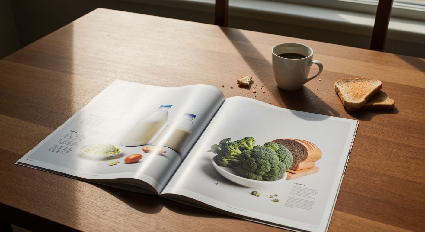
I spent an oddly long time staring at the new crop of supermarket catalogues. Not for the cheese specials, but for the design. Something strange has happened to them. They have quietly started looking like lifestyle magazines. Less clingfilm, more curated cornucopia. The milk no longer sits under fluorescent chill. It now lounges in a moody ceramic jug beside artisanal sourdough. This is not your grandmother's grocery flyer.
Why the sudden glamourisation of the $7.99 butter promotion? It is the ripple effect of retailers chasing the same visual language as premium brands. The typography whispers abundance, not urgency. The photography has soft shadows and shallow depth of field, as though your pantry staples demanded a cinematographer. Even the paper stock feels thicker, as if your weekly mince and bananas deserved a coffee table book.
Yet, there is a delightful tension. These catalogues must still reassure shoppers that a head of broccoli remains just $1.99, no matter how lovingly it has been backlit. The marketer's challenge lies in balancing aspiration with accessibility. Get it right and you make the price feel like a luxury secret. Get it wrong and you look ridiculous, gilding a pack of fish fingers like they were Champagne.
I cannot decide if this is genius or deeply silly. Perhaps both. What I do know is the modest flyer has become an unlikely canvas for some of the most experimental design in town. Next time one comes through your letterbox, resist turning it into firelighter straight away. There is a story hiding between the spinach bundles and the markdowns, and it is about how design slowly rewires our daily rituals of choice.