Sticky Labels and the Myth of Minimalism
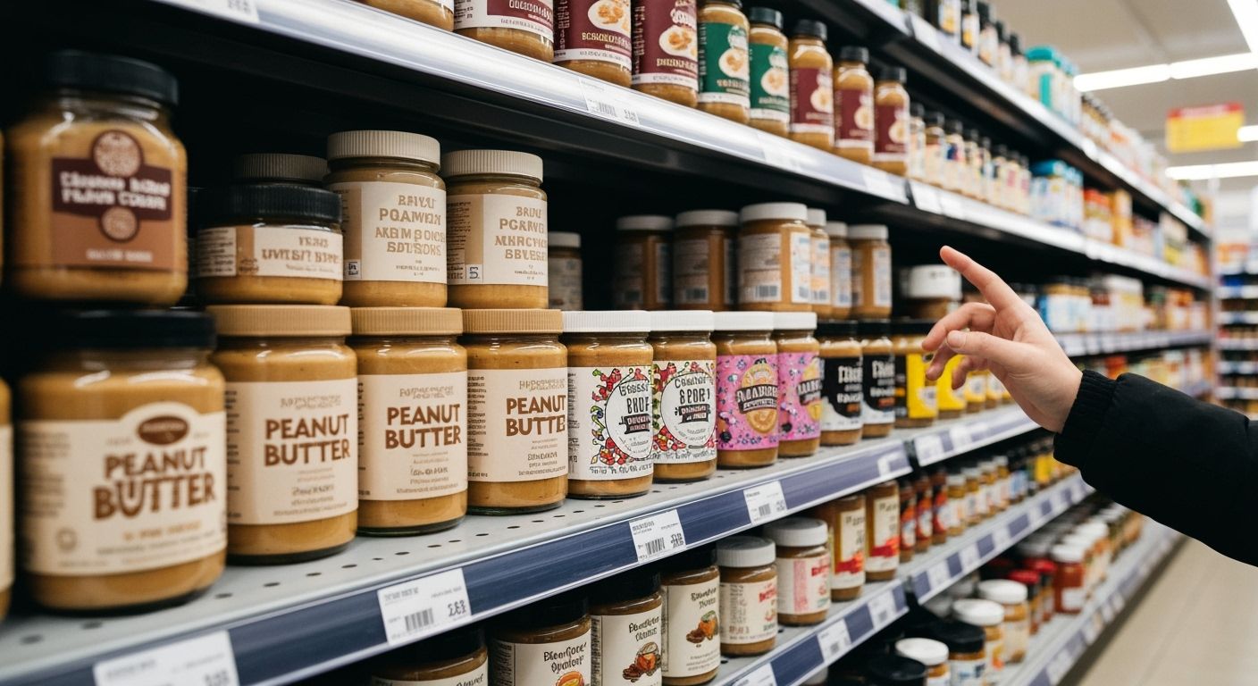
Let’s talk about supermarket packaging. No, don’t yawn. I’m serious. Go to your local New World or Countdown, stand in the condiments aisle, and really look at the peanut butter jars.
Why does every other one look naked now? Minimalist labels with Helvetica knockoffs and beige-on-beige colour palettes. It’s like peanut butter has adopted the aesthetic of an architect’s Instagram feed. Somewhere along the way, design stopped being about shelf impact and started being about collective restraint. Congratulate yourselves, branding world: half the new FMCG launches now look like they’re ashamed to be seen in daylight.
And yet, this shift didn't come out of nowhere. The trend toward ultra-minimalism seeped in with the rise of DTC brands, all surgically designed to look premium, clean, and inoffensive in your pantry. Think Seedlip. But now, this design fatigue is setting in. A new wave of challenger brands—often from Europe or surprisingly Ballarat—have started jamming personality back onto their packaging. Illustrated fruits with sunglasses. Wonky typefaces. Actual joy.
Here’s the thing: brands forgot that supermarket shopping isn't a silent art gallery stroll. It's chaos. Crying kids, fluorescent lights, five seconds to choose the right tahini. You need a pack that grabs attention, not fades into a Pinterest moodboard. Stop pretending shoppers have the time to decode Pantone eggshell and accidental whitespace. If your jar looks like it could disappear into a Muji shelf, it probably will.