The Tragic Decline of the Supermarket Flyer
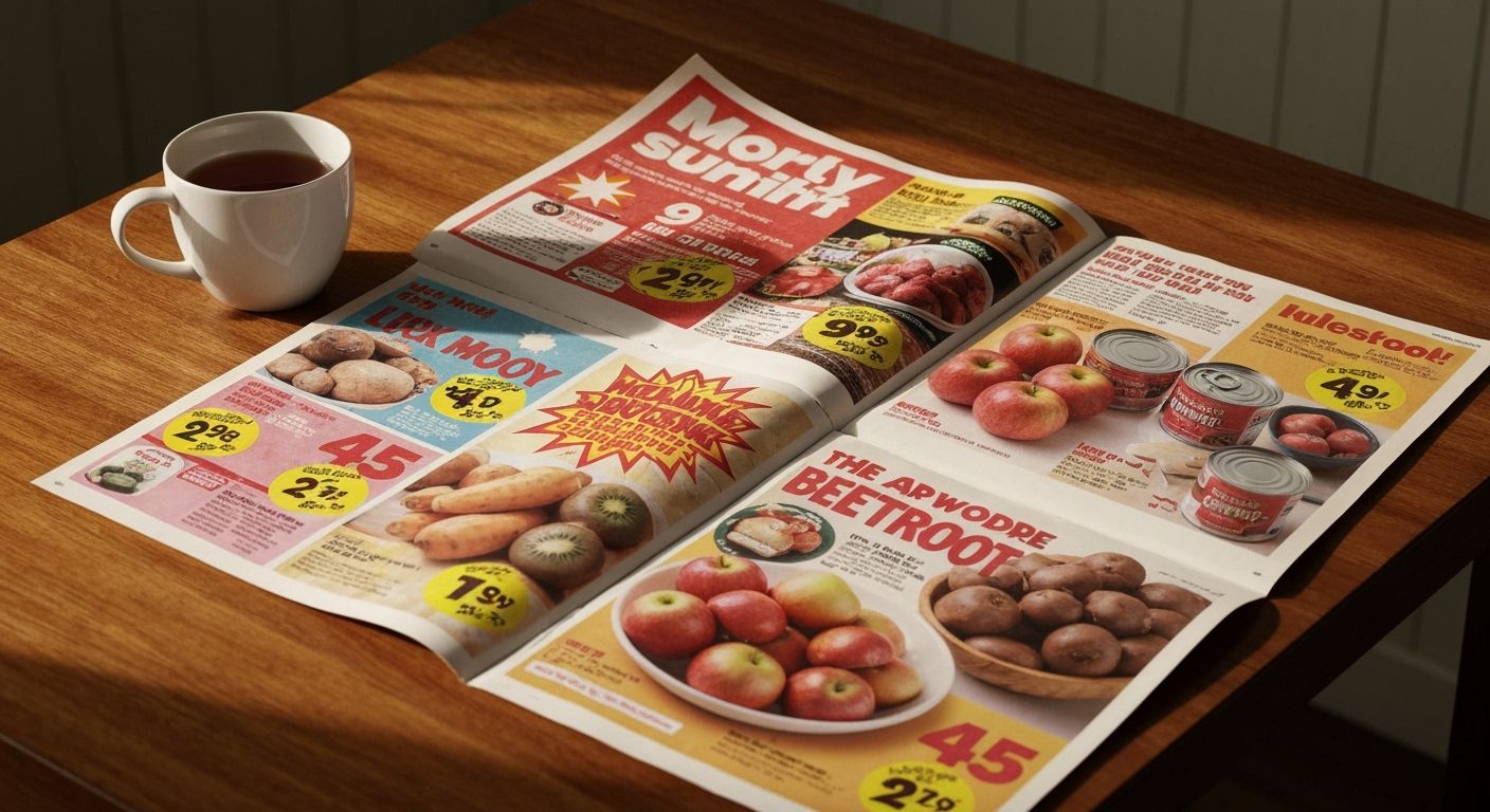
I was at Countdown last week, loitering by the oranges, when I noticed something missing. The sacred paper flyer. You know the one. Folded like a map from 1998, its glossy pages bursting with specials that danced somewhere between absurd and oddly poetic. Kiwi Bacon just $6.99, plums from Hastings, 3 for $4. It was more than a promo booklet. It was visual rhythm.
We’ve quietly replaced it with email spam and clunky PDFs. Now you have to dig through a mobile app like you’re defusing a bomb, searching for yoghurt at 30% off. Something tactile got lost. The flyer wasn’t just marketing. It was a ritual. A kind of print poetry that disguised capitalism inside big red starbursts.
Here’s the thing about design: when it passes through too many filters and KPIs, it loses soul. The supermarket flyer, in its heyday, was designed chaos. Fonts too loud, colours screaming, items floating in a surreal paper salad. But somehow it worked. Not just for boomers. Gen Z would secretly love it too, the same way they fetishise VHS fuzz and chunky headphones.
So I mourn the flyer. But it’s not dead yet. A few local grocers down south are still printing them properly, and I salute them. When we talk about brand, we forget emotional touchpoints like this. Not a bloody TikTok trend. Give me a good Fruit of the Week page. One that smells faintly of offset ink. That’s heritage marketing worth saving.