The Mystery of the Disappearing Typeface on K-Road
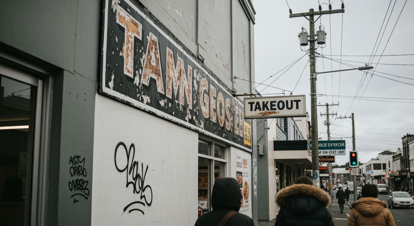
There’s a ghost sign on Karangahape Road that’s been bothering me for months. Half-visible lettering, eroded by weather and years of creative neglect, peeks out above an old Turkish kebab shop. It once said “Modern Drapery,” though you’d need a lifelong relationship with kerning to spot it.
That one faded sign triggered a personal rabbit hole into the typography of Auckland shopfronts, which, frankly, are a mess. Not in a charming, rebellious way either. I'm talking stretch-compressed Arial, Comic Sans with drop shadows, faux-handwritten chalk fonts on laser-printed A4s. It's a brutalist gallery of glorious inconsistency. And yet, none of it seems intentional. It’s as if we gave up the idea of visual identity at street level.
Here’s the irony. We pour cash into TVCs and social content with perfect art direction, yet the tiniest real-world interaction – the sign above the door – often gets the least creative love. Sure, a logo redesign makes headlines. But the moment it’s slapped ugly onto weatherboard, it dies a quiet design death. We don’t talk about that shift from brand system to physical reality. We should.
So here’s a plea. Next time you wander down Dominion Road or out West to Henderson, look up. Squint at the typography. Wonder if someone cared enough to make it beautiful. Or if it was banged together in Word 2003. Either way, the streets are speaking. Even when the message is slightly off-centre and all-caps.