My Month with a 1980s Pottery Magazine and a Marketing Lesson I Didn’t See Coming
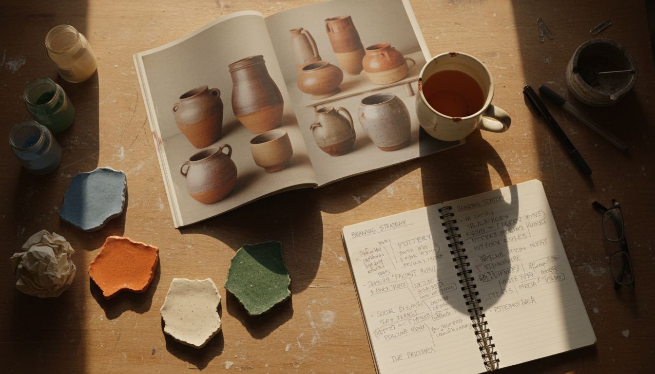
Some people rediscover sourdough. I rediscovered ‘Clay Form & Function’—a frankly magnificent 1984 publication devoted entirely to studio ceramics. Found it at a church fair in Devonport, nestled under an unlabelled Dungeons & Dragons manual. Of course I bought it. I read every page. Twice.
What surprised me wasn’t the glazes or the somehow-defiant neutrality of the photography. It was the ads. Real, printed, pre-digi ads. 'Persimmon Studio Clay Bodies – now even smoother!' said one. Another from a kiln distributor used an 18-point serif to promise 'dependable heat'. And here's where the worm turned. These ads weren’t trying to be cool. They weren’t clever. They were functional in the best way—an ecosystem where purpose beat poetry and trust was king.
Compare that with 2026, where a vermouth brand CEO uses phrases like 'semantic liquidity' on launch day. Our industry has become so allergic to the practical that even logos can't just sit still anymore. They must twitch, morph, narrate. Everyone’s storytelling. No one is explaining. But old pottery ads? They told you what the thing was, what it did, how it would make your life better. Brick simple. Honest.
There’s rich territory here. Not in regressing. But in remembering. That somewhere between two-minute brand manifestos and TikTok skits, there’s room to just... be functional. Maybe useful is the new sexy. Or maybe I’ve inhaled too much vintage glaze cataloguing. Either way, get your hands on old print. It’s meditative, a bit dusty, and still better than a brief written by a committee of eleven.