What a Tomato Sauce Label Taught Me About Confidence in Packaging
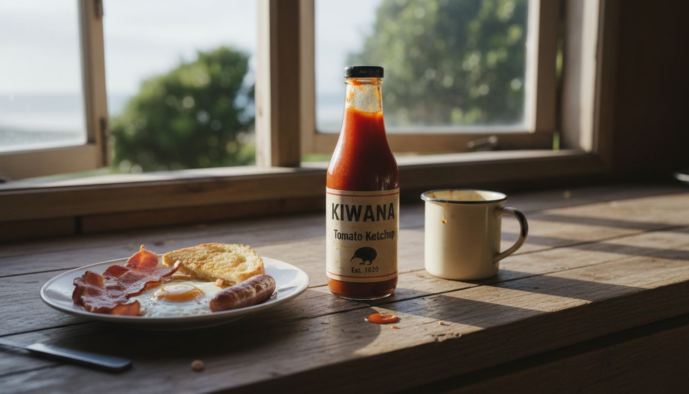
Last week, in a dodgy bach pantry somewhere north of Whangarei, I found a bottle of tomato sauce that completely altered my view on packaging confidence. There it stood: matte finish, no shiny plasticky red, no aggressive fonts shouting “taste explosion.” Just a single tomato, off-centre. No slogan. The label simply said, "Tomato Sauce" and a quiet reassurance in tiny script: "Good with eggs."
I don’t want to overstate this, but I stared at that label like it had just told me a secret. Because here's the thing: in an industry that thrives on overstatement and buzzwords, this bottle wasn’t trying. It trusted the product. That kind of restraint? That’s a design flex. Not minimalism for minimalism’s sake, but an actual point of view: that maybe shouting isn’t always more effective than whispering.
We've spent the past ten years watching FMCG brands scramble for attention, layering on backstories and fake nostalgia. This sauce bottle did not care about your childhood mems or your molecular umami receptors. It assumed you were already here because you like tomato sauce. And it reminded me of how good design isn’t louder, it’s clearer. The opposite of forced good vibes.
I’ve started calling this approach 'quiet assertiveness'. It’s not about stripping things back to beige and calling it premium. It’s about reducing the noise until the honesty gets through. Brands who can do that in 2026, especially in a sea of edible confetti and sentient snack mascots, might be the ones who earn lasting affection. I don’t know who made that sauce and now I can’t stop thinking about it. That’s real brand impact.