Why a Tongan Flea Market Poster Made Me Rethink Regional Design
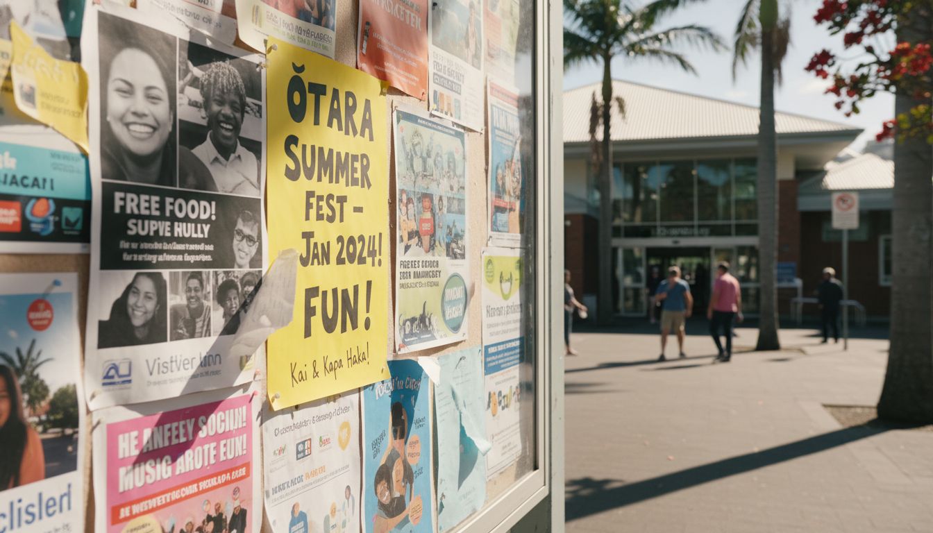
Over the summer break, I found something remarkable on the noticeboard outside the Ōtara library. It was a poster—A3, fringed with curling sellotape, printed on the kind of yellow paper that practically glows in the heat. Promoting a flea market. But what got me wasn’t the event, it was the layout. It shouldn’t have worked. There were five different images (badly cropped), scattered fonts (I counted six), and the headline was in Comic Sans with a drop shadow that screamed 1999. But standing there, I realised I couldn’t stop looking at it.
This wasn’t designed by a studio or run through a hierarchy of creative leads. It was probably stitched together on a shared computer in the back of a church hall. Yet it was honest. Playful. Proudly inconsistent, like it was juggling three different moods and no-one told it to calm down. And somehow, it was more engaging than half the glossy campaign ads I’d seen on Queen Street that month.
We spend so much time sanitising our visual culture in this country. Stripping away texture until everything ends up looking like the same polite grid. But real communities don’t communicate like that. They’re noisy, multi-layered, full of contradictions. And design—real design—should speak in their language. Not about them, but with them.
I’m not saying we bin the grid systems. I’m saying let’s stop pretending they've ever been the only option. There’s a whole micro-economy of aesthetics in Aotearoa that’s never set foot in a studio. Maybe it’s time we got out of the studio more often too.