The Tragedy of the Rebranded Sausage Roll
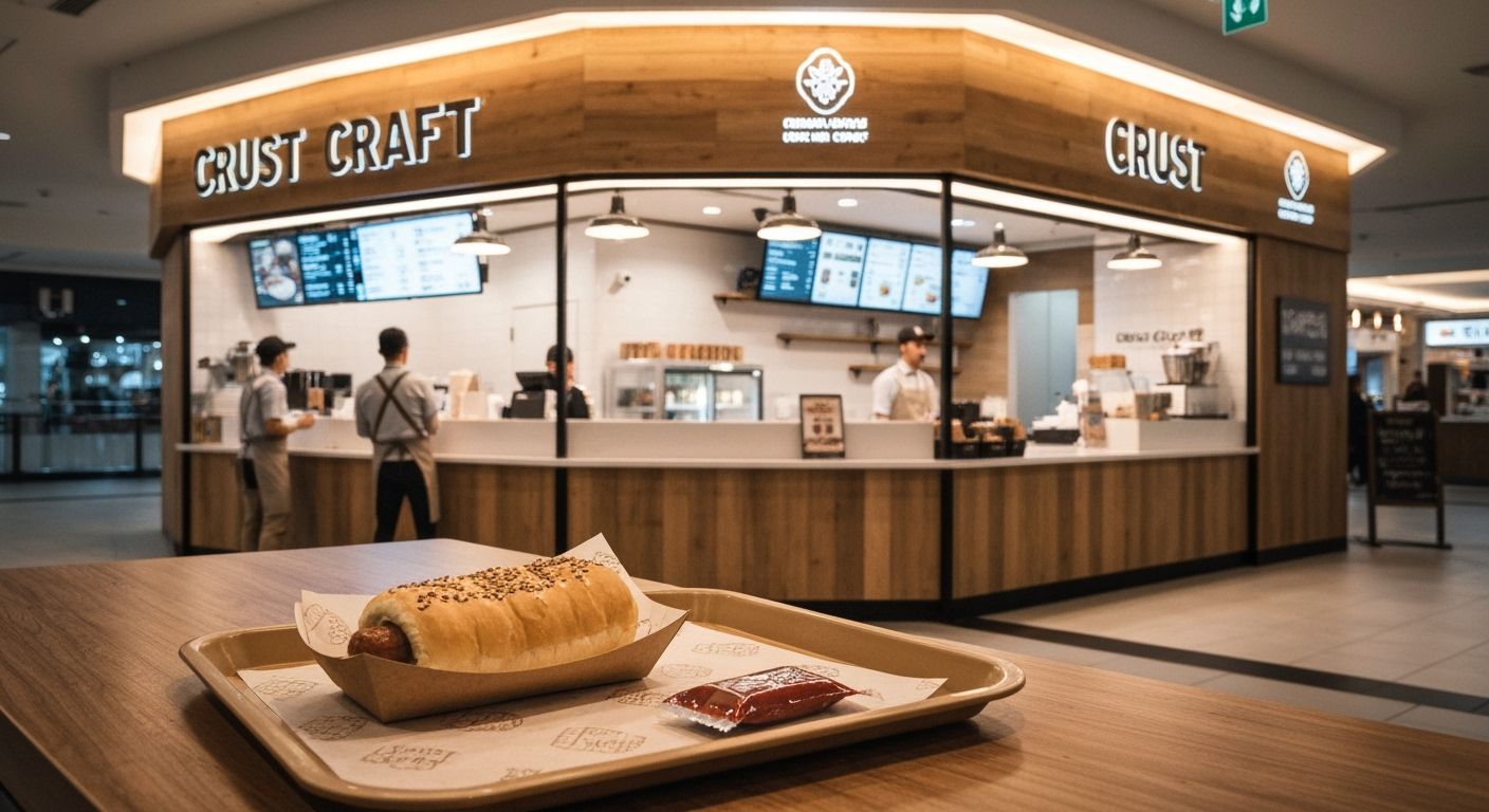
Last week I stumbled across a mall food court kiosk called "Crust Craft". Clean typography, mood lighting, artisanal signage. A brand that has clearly undergone an expensive Instagram baptism. But zoom in and there's the unmistakable scent of sausage rolls under a heat lamp, served with Wattie’s. You’ve met this brand before. Only a few months ago, you walked straight past it when it was called Barry’s Bakehouse.
This is not an attack on sausage rolls. Quite the opposite. It’s a lament for the senseless rebranding of the humble Kiwi snack into a lifestyle product. Design agencies and brand consultants are rushing to polish small food brands into these vague, globally neutral shells. In the process, they strip them of character, history, and the kind of unpretentious charm that compels a second visit. Did Barry need a new visual identity? Possibly. Did he need a name that sounds like a Scandinavian furniture blog? Probably not.
For years we’ve been pushing brands to be ‘less local’, to compete globally with smooth pastels, sans-serif wordmarks, and ambiguous names that resemble either a surfwear label or an oat milk startup. We forget that specificity sells. What if Barry leaned even harder into his 1983 meat pie empire vibe? What if the menu board still had prices ending in .90 and the logo was unapologetically red and yellow? Brands like Ed’s Juice at the Otara Markets survive not despite their look, but because of it. It feels real.
There’s room for polish, of course. Even the dirtiest petrol station needs good hygiene. But when we sand down the identity in favour of looking like everyone else, we flatten what made it memorable to begin with. You can’t out-Melbourne Melbourne. But you can be Patea, proudly and without irony. If our goal is to be noticed, let’s stop dressing our sausage rolls like gluten-free luxury. Sometimes a pastry just wants to be a pastry.