How Helvetica Took Over Aotearoa (and Why It’s Getting Boring)
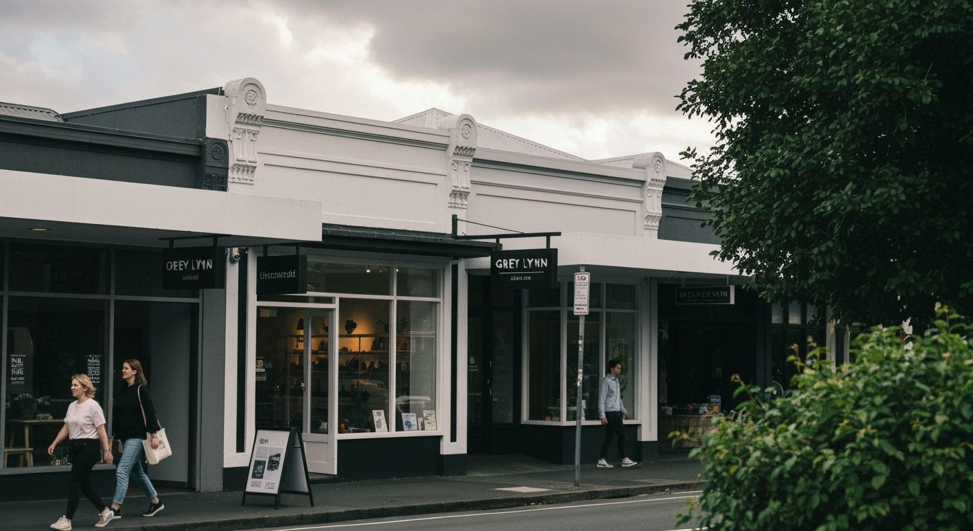
I was walking past a boutique coffee roaster in Grey Lynn last weekend when I noticed something strange. Their new branding looked exactly like the new oat milk startup, which also looked suspiciously like the architectural firm two doors down. All of them: black-and-white colour scheme, sans serif fonts (mostly Helvetica, maybe Arial pretending), and a minimalist logo that looked like someone gave up halfway through a good idea.
This isn't about taste. This is about our plague of sameness. New Zealand brands have quietly homogenised under the comforting yoke of international design tropes. A decade ago, we had charm. Quirky hand-lettering, bold colours, the odd sheep pun. Now, we're drowning in Helvetica and beige. Designers aren’t making art, they’re making LinkedIn portfolios. You can almost hear the client feedback: “Clean. Simple. Scandinavian vibes.”
And yet, the more we design to fit in, the less we stand out. Look at Australia’s visual identity for its arts funding programme — wild gradients, type that dances off-centre, actual risk. Compare it to ours and we look like a pharmaceutical brochure. There’s a place for Helvetica, sure. On Swiss train stations. But in Tāmaki Makaurau? Maybe it’s time we let our brands speak with their own accent again, not just imitate Melbourne’s mood board.
I’m not calling for a Comic Sans revolution. (Although, let’s not pretend ‘professional’ has one definition.) I am calling for a local design voice. Maybe even multiple. Ugly can be interesting. Weird sticks. Beige gets lost in your inbox. If design is how you say what you’re about, New Zealand brands need to start saying something besides, “Don’t worry, we fit in.”