What Antarctic Maps Taught Me About Supermarket Layouts
Last month, I fell down a rabbit hole while looking at aerial maps of Antarctic research stations. Stay with me. These layouts, designed for survival, efficiency and zero dead ends, reminded me of something both entirely different and surprisingly similar – my local supermarket.
There’s a brutal elegance to these stations. The way you always loop back to safety. How the mess hall sits like a sun at the centre of multiple routes. Nothing is wasted. Unlike my last trip to New World, where I went in for laundry detergent and left with six kinds of crackers, two jars of olives and a slight sense of betrayal. Retail layouts aren’t just inefficient, they’re sneakily brilliant. And not in the way you might think.
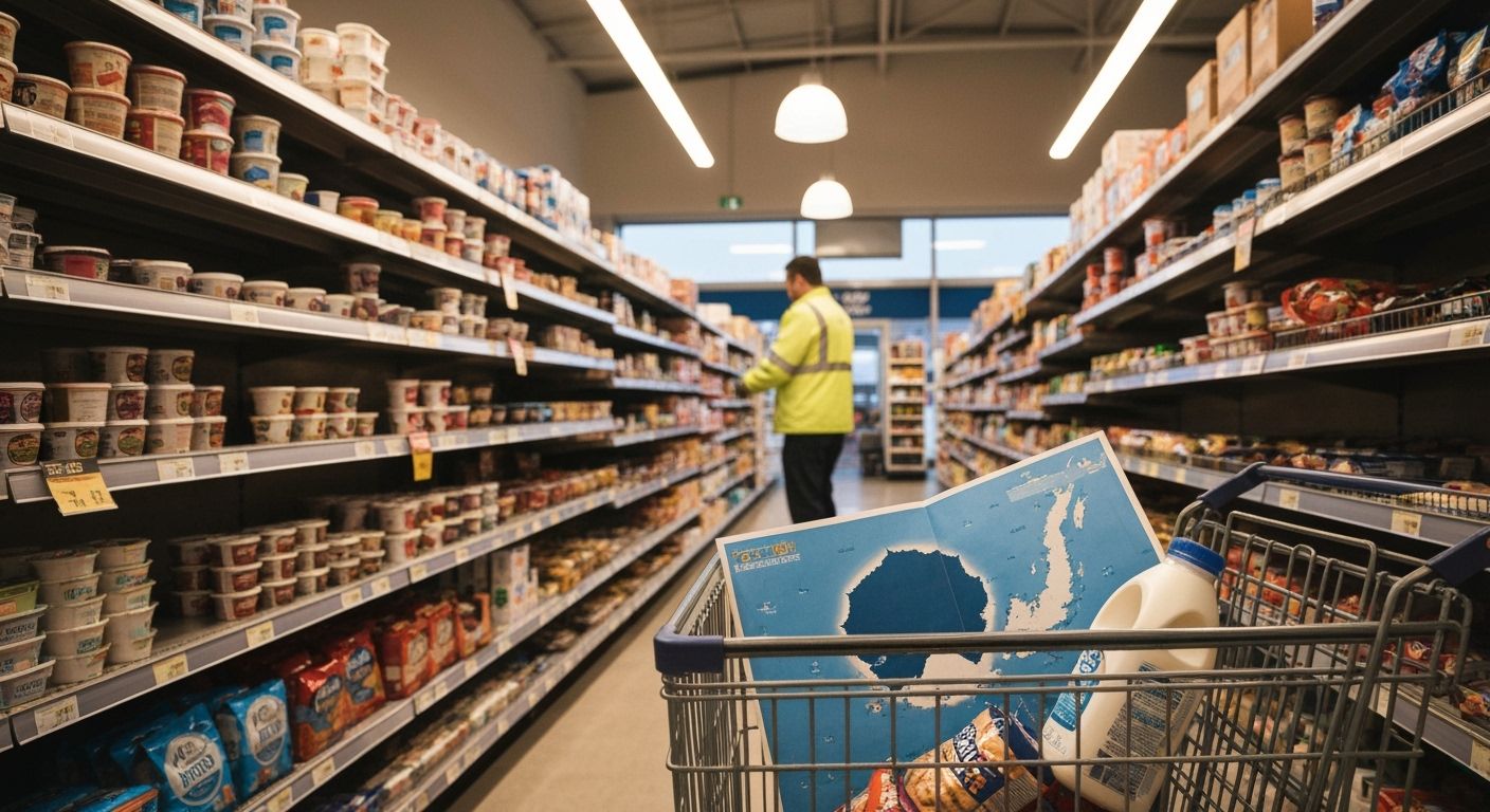
Every aisle is a decision point masked as a convenience. You think you’re navigating by logic. You’re not. You're being nudged by the exact science of behavioural economics dressed in signage. It’s not about selling you stuff. It’s about making you wander. Longer dwell time equals higher spend, but it also means more chance for emotional absorption. Brands know this. They exploit our mental ‘map fog’. It’s part of the reason milk is always at the very back. You don’t land in the cold. You trek there.
Meanwhile, I think we could learn from the Antarctic folks. What if we built supermarket experiences with a bit more trust? Still allow for discovery, but with thoughtful flow. Less maze, more mission. Customers may actually buy more if they don’t feel manipulated. After all, no one resents reaching base camp before dinner. Not even in minus 40.
There’s a brutal elegance to these stations. The way you always loop back to safety. How the mess hall sits like a sun at the centre of multiple routes. Nothing is wasted. Unlike my last trip to New World, where I went in for laundry detergent and left with six kinds of crackers, two jars of olives and a slight sense of betrayal. Retail layouts aren’t just inefficient, they’re sneakily brilliant. And not in the way you might think.
Every aisle is a decision point masked as a convenience. You think you’re navigating by logic. You’re not. You're being nudged by the exact science of behavioural economics dressed in signage. It’s not about selling you stuff. It’s about making you wander. Longer dwell time equals higher spend, but it also means more chance for emotional absorption. Brands know this. They exploit our mental ‘map fog’. It’s part of the reason milk is always at the very back. You don’t land in the cold. You trek there.
Meanwhile, I think we could learn from the Antarctic folks. What if we built supermarket experiences with a bit more trust? Still allow for discovery, but with thoughtful flow. Less maze, more mission. Customers may actually buy more if they don’t feel manipulated. After all, no one resents reaching base camp before dinner. Not even in minus 40.