NZ Agency Launches Revolutionary 'VagueCore' Aesthetic to Capture Consumer Confusion
AUCKLAND, NEW ZEALAND — In a move that's already being described as 'brave' by people who clearly didn't understand it, boutique agency Clarity&Co has unveiled 'VagueCore,' a groundbreaking new visual direction said to perfectly embody the feeling of being marketed to, but not really knowing why.
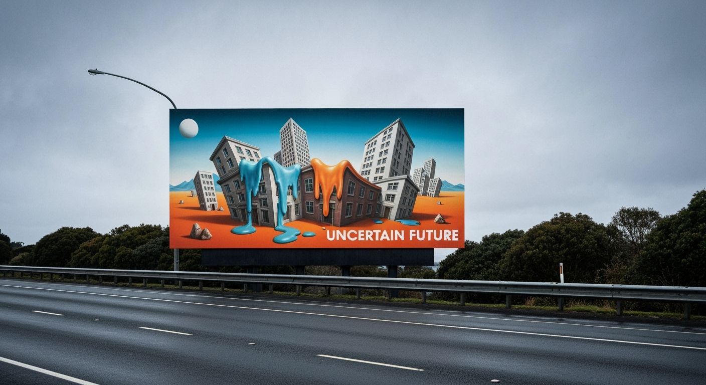
The VagueCore lookbook, launched Tuesday night at a warehouse that may or may not have been fully consented, features muted colours, ambiguous taglines like "Possibly Something" and models who all look like Newtown baristas who’ve just read their first Piketty. The campaign's highlight is a billboard on SH1 that simply reads, "Still Deciding." When asked what it was promoting, the creative director replied, "Exactly."
According to Clarity&Co’s head of 'consumer intuition mapping,' Sarah-Mae Fielding, the aesthetic was born out of a focus group that misread the question "What do you want from a brand?" as "What do you want from life?" The resulting spreadsheet, now printed and framed in their reception area, features responses like “less collapse” and “the warm buzz of passive relevance.”
The first client to adopt the VagueCore approach is a mid-tier oat milk brand called Fuzz. Their new packaging features only a cream-coloured square and a QR code that leads to an out-of-focus photo of a flax bush. Early data shows a 240% increase in "lingering consumer squint,” a metric the agency insists is meaningful. When asked what’s next, Fielding simply said, “We’re pivoting toward pre-emptive nostalgia now. It’s like retro, but sadder.”