Why Every Supermarket Catalogue is a Masterpiece of Manipulation
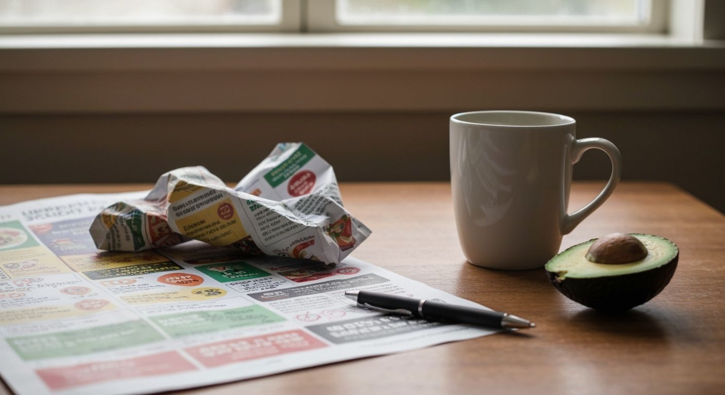
Let’s talk about something nobody wants to admit: we all secretly love a supermarket catalogue. Not just for the specials on smoked salmon, but for the masterful choreography of colour, price psychology, and layout wizardry. These things are marketing Swiss Army knives disguised as 12-page paper pamphlets. You pick one up to check if mandarins are in season, and suddenly you’ve committed to a bulk cheese haul and a new brand of cereal that features cartoon astronauts.
Here’s the kicker: supermarket catalogues don't just sell groceries. They sell tempo. They choreograph your week. Count the number of times you’ve planned a Wednesday dinner off the back of a catalogue’s slow-cooked beef feature. These layouts are engineered to activate your latent need to feel productive, domesticated even. Some pages lull, some pages shout. The secret? Typography hierarchy, directional imagery, and the deliciously manipulative rule of thirds. And don’t get me started on the joy of a ‘was $12.99, now $7.49’ boxed in red. That’s not a discount, it’s a story arc.
It’s not that these designers are just clever, it's that they’re precise. A roast chicken placed slightly to the top-right of the page (next to a sprig of thyme for moral support) is subtle genius. There’s negative space psychology defined by baked goods and seasonal fruit halos. Even the dodgy photography has a role to play, adding that slightly DIY, honest-Kiwi-retailer charm. Half the time the food looks like it was shot by someone’s uncle on a Motorola—but that's the point. It draws you in with the promise that, yes, you too can replicate this humble feijoa crumble.
So the next time you flick through that glossy Pak'nSave or New World flyer with your morning coffee, pause for a minute. You’re not just flipping through specials. You’re experiencing a uniquely Kiwi form of retail theatre. And it deserves a standing ovation, or at least a nod during your mid-week pasta bake.