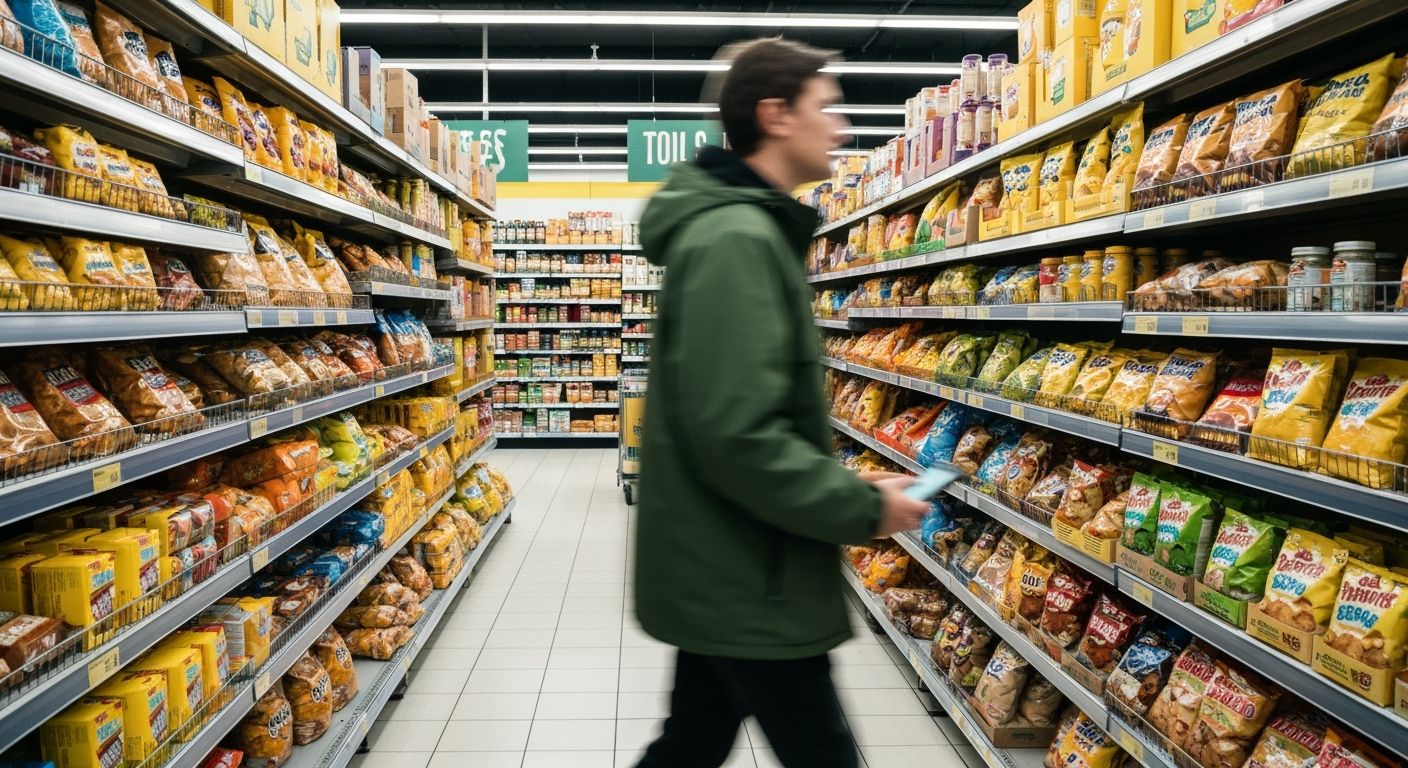
How the Colour Yellow Quietly Took Over Your Supermarket Aisle

It starts with cornflakes. Or perhaps it's the potato chips. Whatever your entry point, you've seen it before: bright, inescapable yellow. Not gold. Not mustard. We're talking the kind of yellow that slaps you awake. The kind that screams YOU NEED THIS, even when you wandered into the snack aisle looking for rice. Somehow, over the last two decades, yellow packaging has carved out a retail empire.
Dig into consumer psychology and you'll find the usual suspects: yellow = happy, energetic, attention-grabbing. Sure. But what they don’t tell you is that this tactic has snowballed into a chromatic arms race. One yellow bag of crisps? Cute. Three shelves of yellow potato-based temptations? You’re trapped. In the language of design, this is less of a trend and more of a territorial takeover. I walked through three different Pak'nSaves (research, not madness) and counted 47 unique snack brands using yellow as their primary colour. Coincidence? Not likely. That’s retail Darwinism.
It’s not just snacks either. Laundry powder, cleaning products, even some pet food brands have joined the yellow wave. These companies aren’t just vying for your wallet. They’re battling for milliseconds of your attention in a fluorescent-lit arena where packaging is the pitch. They know that even if you don’t consciously register it, yellow screams louder than navy, whispers sweeter than burgundy, and looks far less sinister than black.
So why does this matter for marketers and designers? Because when every brand zigs into yellow, the real rebels zag elsewhere. The brands that dare to go dark green, icy silver, or subdued terracotta suddenly look more premium, more thoughtful, more trustworthy. As my local grocer once muttered while restocking the crackers, “It’s all damn sunshine till someone asks for gluten-free.” In a market full of noise, maybe the quietest colour will start winning again.