How Tampons Taught Me About Smart Packaging Design
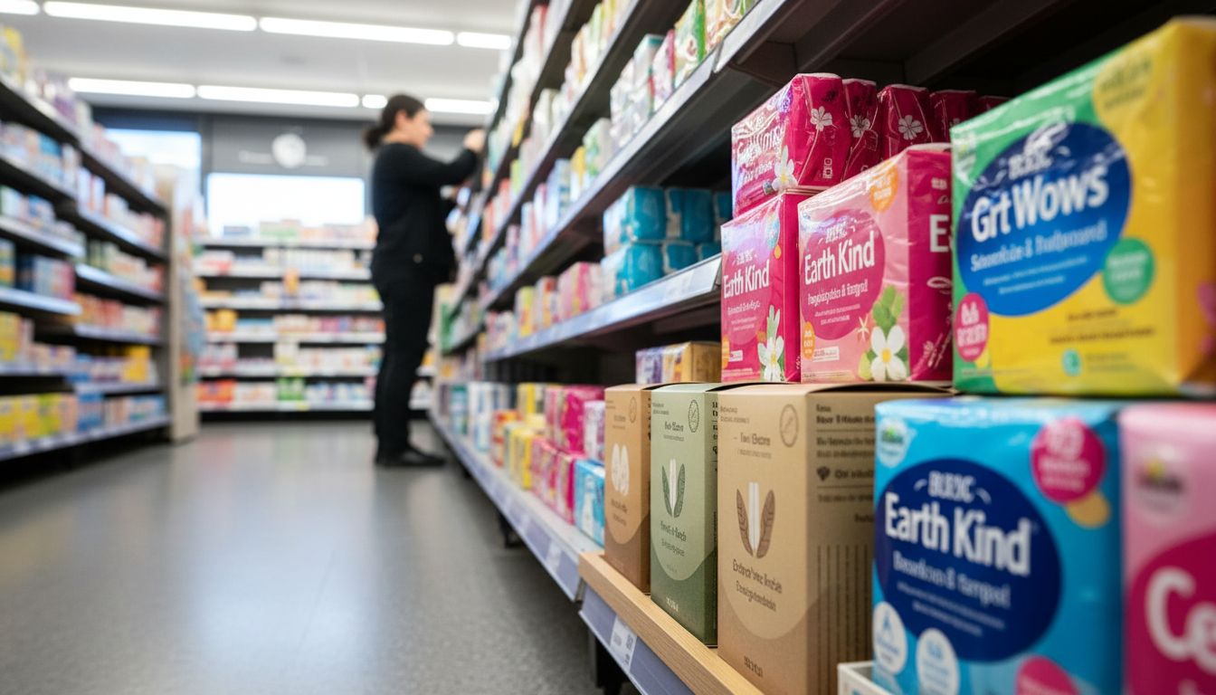
I spent twenty minutes in a Countdown aisle staring at tampon boxes. Not because I needed one, but because I couldn’t believe how aggressively loud, pink, and patronising most of them were. Then tucked awkwardly at the bottom shelf, I spotted a small New Zealand brand with a matte cardboard box and simple language: '100% cotton. No perfumes.' It did not scream. It whispered.
This wormhole began in aisle six, but it led me deep into the mechanics of packaging design for products we’re told to hide. Tampons, pads, condom boxes, haemorrhoid creams. The things we all buy, yet nobody talks about. For decades, the default setting has been to coat these packages in fluorescent denial, hoping that no one stops to think about them. What this bland-brilliant cardboard box did was normalise, not sensationalise. It was designed for a real person, not a hypothetical 'female consumer aged 18–35' from a key demographic slide.
Good packaging doesn’t demand attention. It earns it. And yes, I know that sounds like marketing chest-beatery, but in the case of previously stigmatised products, it really matters. A better-designed box tells a story of respect. Quiet confidence. It says, we got you, no glitter required. There are signals that show real understanding of your target without shouting the brief at them. New Zealand brands are starting to do this well, especially in health and wellness categories. Less rainbow vomit, more smart subtlety.
So next time you’re hunting insights, maybe head to a pharmacy shelf instead of a Pinterest board. Watch what people pick up, not just what has the splashiest gradient. You'll see which brands know their customer–and respect them enough not to yell.