This Billboard Got a New Font and Somehow Ruined My Week
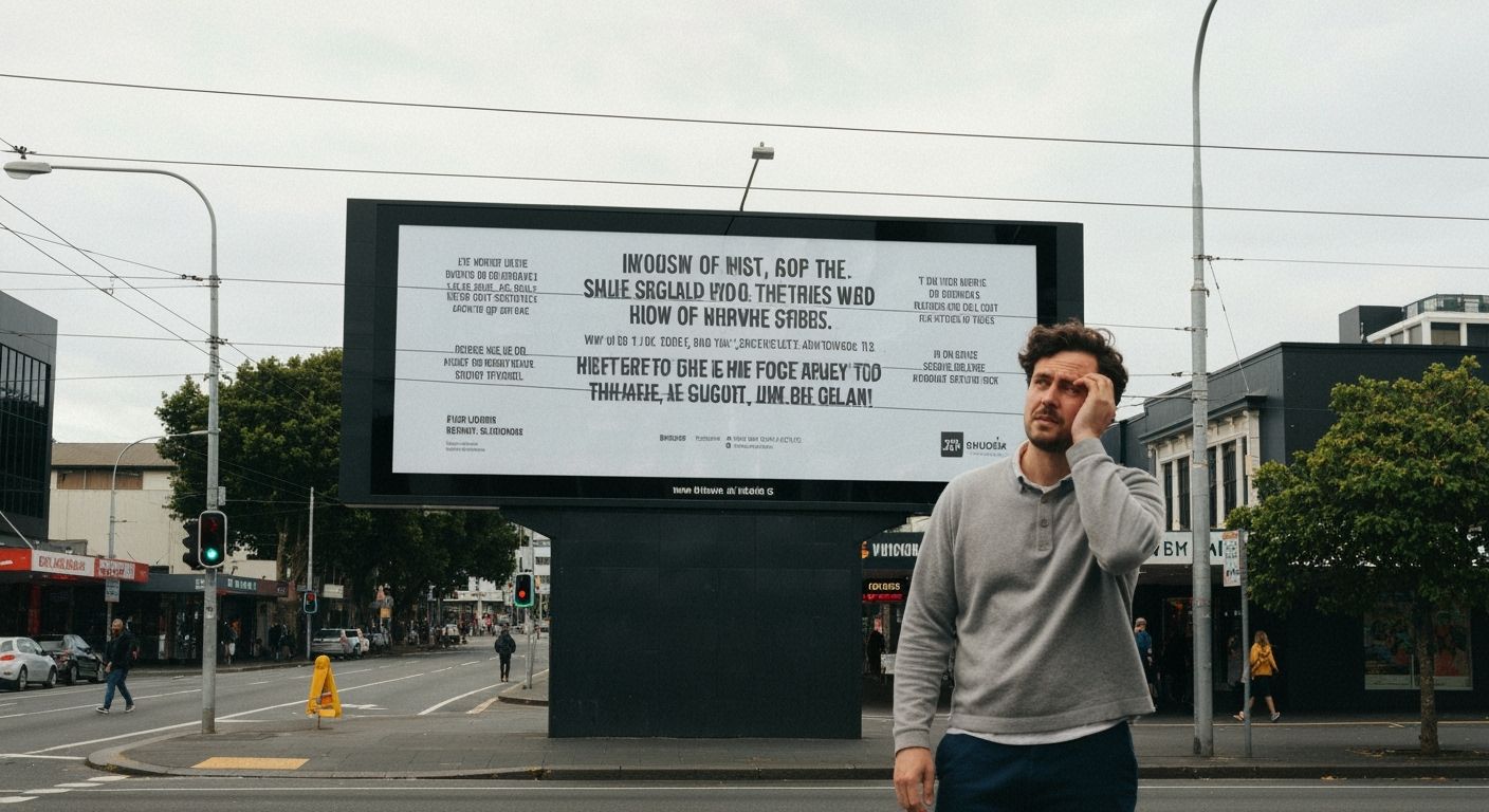
The billboard on the corner of Karangahape Road and Ponsonby sprawls across the intersection like it owns the traffic. I walk past it every morning. Usually, it's just a rotating display of perfume ads, chewing gum campaigns, or the occasional cinematic explosion of a car flying through space. But last Monday, something changed.
The brand (I won't name names, but it rhymes with ‘highly corporate beverage monster’) swapped out their usual sharp sans-serif for an awkward geometric font smashed between overexposed photos of smiling 20-somethings. The tracking looked off. Kerning? Non-existent. And don't even get me started on the way the descenders on the lowercase ‘g’ crashed headfirst into the facial anatomy of the stock models below.
I stood there for a full two and a half minutes, perplexed. Do brands think Aucklanders don’t notice typography? That we wake up, check the weather, and choose to ignore how a logo suddenly feels cheap because someone in the brand department fell in love with a ‘retro tech’ aesthetic on Pinterest?
Good design doesn't shout. It whispers conspiratorially to the right hemisphere of your brain and convinces you that you like what you're seeing. Bad design? It yells. And when it yells with Comic Sans energy disguised as 'minimalist grunge,' it doesn’t just hurt the brand. It bruises the whole campaign. No amount of budget can hide poor type choices. Like a nice suit covered in marmite stains. And in Auckland, where visual culture is stitched into our sidewalks and sea views, we deserve better than a font that feels like a mistake your computer makes when the real one failed to load.