What the French Toast Is Going On with Picnic Branding?
We need to talk about picnic packaging. I know, it’s February. But the summer run of outdoor snackery is in full swing, and I have spent an unhealthy amount of time dwelling on one peculiar thing. Why are eco snack brands suddenly obsessed with referencing the French countryside?
Every flax-wrapped almond tin, every olive spread carton, every carton of pre-pickled radish comes with a hand-drawn line sketch of a rattan basket, a gingham cloth and, inevitably, a bicycle that no actual New Zealander has ever used to transport camembert. Some even throw in a cartoon heron or a windmill. It’s all very Provence-by-way-of-Dunedin, and it’s beginning to feel more like a confused mood board than a brand strategy.
Here’s what I think is happening. There’s a knee-jerk marketing reflex that equates nostalgia, land, and leisure with authenticity. But instead of tapping into actual New Zealand storytelling—the local riverbanks, baches, thermoses, South Island driftwood—brands are importing European shorthand for 'good old days'. It’s charming, yes. But it's also lazy. Cultural borrowing wrapped in sepia tones doesn’t necessarily build trust. It builds… well, sameness. No one is remembering your name, they're just remembering 'that one with the bike and walnuts'.
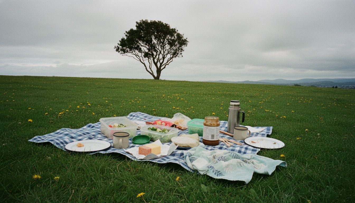
What if picnic brands stopped trying so hard to dress up like French farmers in 1963 and leaned into the weird beauty of our own terrain? Picture this: cracked wax paper, a thermos with ‘Fitzpatrick’ written in vivid, a pottle of tart black cherries nestled next to cheese that got too warm in the boot. There’s real design gold in that specificity. And crucially, it’s not a cliché yet.
Every flax-wrapped almond tin, every olive spread carton, every carton of pre-pickled radish comes with a hand-drawn line sketch of a rattan basket, a gingham cloth and, inevitably, a bicycle that no actual New Zealander has ever used to transport camembert. Some even throw in a cartoon heron or a windmill. It’s all very Provence-by-way-of-Dunedin, and it’s beginning to feel more like a confused mood board than a brand strategy.
Here’s what I think is happening. There’s a knee-jerk marketing reflex that equates nostalgia, land, and leisure with authenticity. But instead of tapping into actual New Zealand storytelling—the local riverbanks, baches, thermoses, South Island driftwood—brands are importing European shorthand for 'good old days'. It’s charming, yes. But it's also lazy. Cultural borrowing wrapped in sepia tones doesn’t necessarily build trust. It builds… well, sameness. No one is remembering your name, they're just remembering 'that one with the bike and walnuts'.
What if picnic brands stopped trying so hard to dress up like French farmers in 1963 and leaned into the weird beauty of our own terrain? Picture this: cracked wax paper, a thermos with ‘Fitzpatrick’ written in vivid, a pottle of tart black cherries nestled next to cheese that got too warm in the boot. There’s real design gold in that specificity. And crucially, it’s not a cliché yet.