Why Every Candle Label Looks Like It Was Designed During a Sponsored Retreat
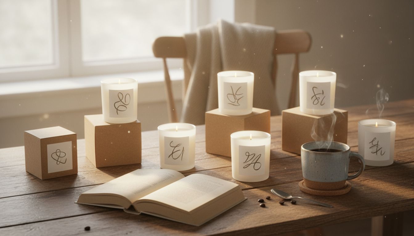
Spend five minutes in a boutique gift store and you’ll notice something peculiar. Every candle brand has quietly agreed on the same aesthetic treaty—warm beige tones, lowercase serif labels, a vague nod to Scandinavian suffering. Apparently, adjectives like 'smoky,' 'musk,' and 'fern' are doing all the heavy lifting now. But here’s the thing: marketing a candle isn’t just about smell anymore. It’s the air of quiet enlightenment. The suggestion that you might, under scented eucalyptus, finally delete all your unread emails.
What’s fascinating—truly fascinating—is how the candle game has morphed into a masterclass in emotional projection. We’re not buying wax, we're buying mood-as-identity. The packaging alone is practically whispering, "Yes, you compost and read novels." Which is strange, because nothing says climate collapse quite like a paraffin blend in a glass jar from Portugal. Still, we fall for it. There's an unspoken rule that the duller the label, the more expensive it probably is. Minimalism now equals mystery, the IKEA effect on steroids.
Even their brand names feel handpicked from an existential poetry course—'Northern Nearness,' 'Field Later.' It’s all so exquisitely vague. And yet, if a candle box said 'Fresh Laundry + Anxiety Reliever,' I’d probably buy five. There's a genius at work here. A manipulation through softness. Candle branding doesn’t scream anymore. It exhales. And hilariously, it works. Walk through any high-end home goods stall and you’ll see confused blokes sniffing mood boards, pretending to understand what ‘pine solitude’ smells like.
The triumph, weirdly, is not in standing out. It's in blending in. The best candle branding now isn’t about shouting from a shelf, it’s about murmuring just loud enough to earn a curated life slot on your side table. Strange? Absolutely. Brilliant? Without doubt.