The Fishing Magazine with Better Branding Than Most Agencies
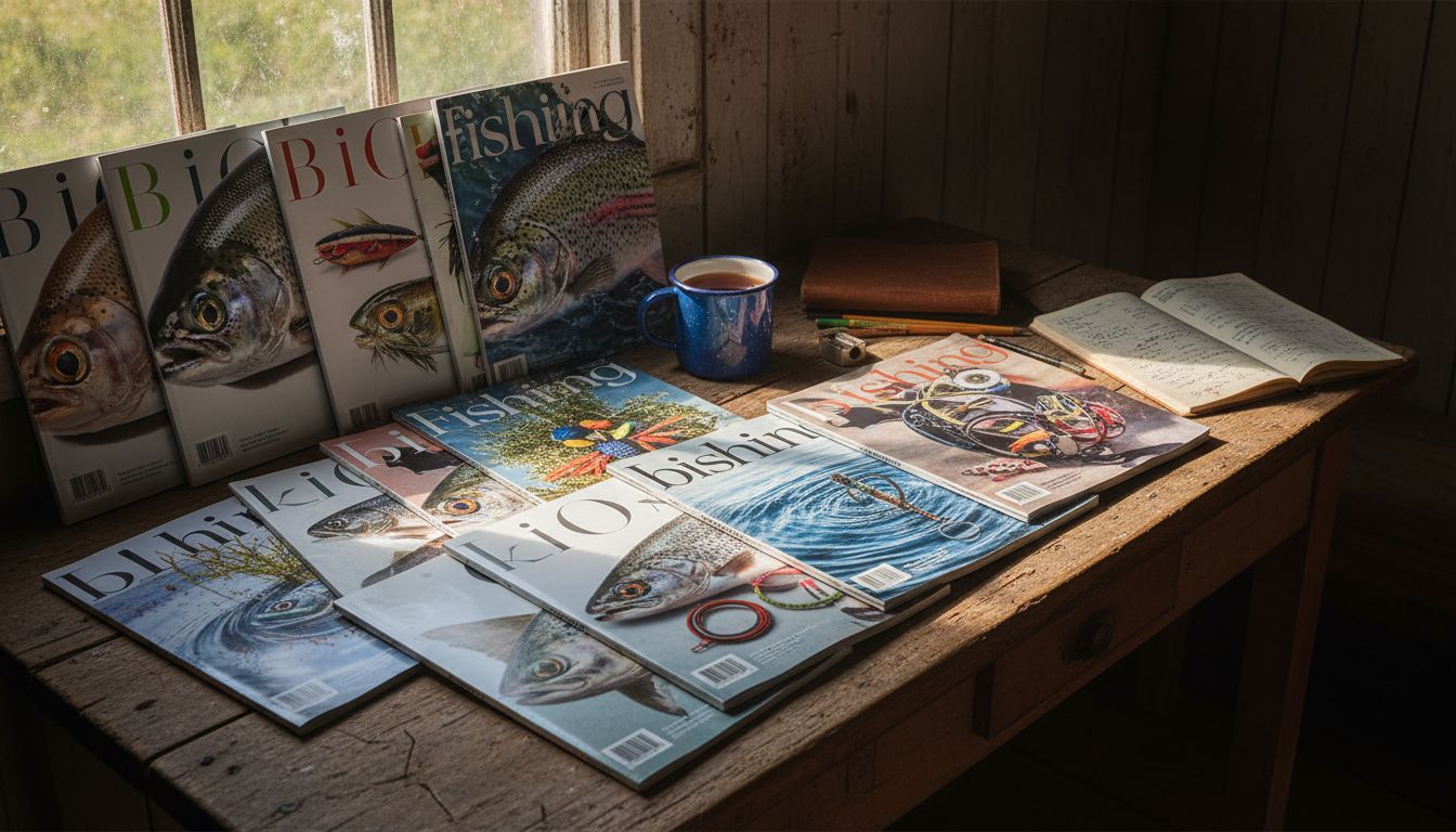
I bought a fishing magazine last week. Not because I fish—not even close. But because the masthead slapped. And then the contents pages slapped harder. Eight full spreads of meticulously art-directed trevally. Colour-matched tackle guides that would make a footwear campaign blush. Product shots that bordered on reverent.
Here’s the thing. ‘Reel Drift’—that’s what it’s called—is put together by a team of five, three of them part-time. They’re two hours north of Napier, operating out of a boat shed with more polystyrene bait bins than laptops. And yet, every issue looks like they funnelled Cannes money through a squid jig net. Not glossy in the usual way. It’s purposeful. Specific. It’s mad how targeted it is. They know their audience. They speak to them like insiders. There’s a real tactility to it. You feel the salt crust just flipping through.
I spoke to one of the editors. He told me they use typography to mimic tide patterns. Every page layout is built around actual fishing data—tide charts, lunar phases, water temperatures. It’s layout by lunar logic. They’re not trying to land brand partnerships. They’re just pedantic hobbyists who learned how to produce something better than most design studios. It’s what happens when craftsmanship isn’t outsourced to vibe decks.
Meanwhile, some major agencies continue peddling projects that feel like leftovers from 2021 pitch folders. That’s the real issue. We overthink polish and underthink specificity. If you want to learn how to build something deeply compelling, don’t study brand books. Study bait magazines made by people who genuinely care about bait. Real passion looks like detail. Even when it smells a bit like mackerel.