How a Handwash Label Broke My Brain (and Made Me Respect Packaging Again)
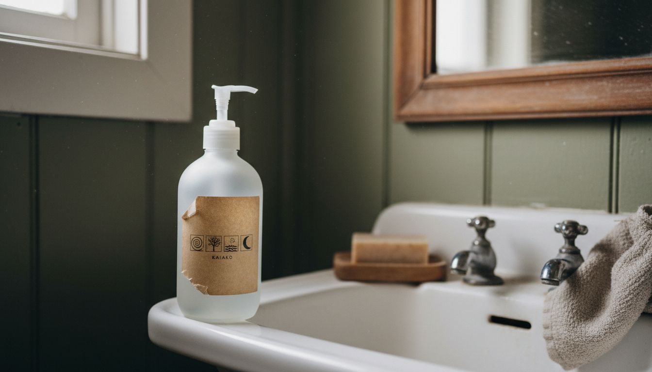
There I was, standing in the bathroom of a rural café outside Ōkaihau, having a casual stare-off with a bottle of handwash. The label wasn’t doing anything outrageous—no neon gradients or fake vintage nonsense. It just had three lines of text, a colour so muted it looked like it had been sun-bleached in utero, and a tidy grid of four symbols that didn’t totally make sense. But I couldn’t stop looking at it. I ended up staying in there long enough that someone knocked on the door.
The genius was in its restraint. The label looked more like a utility form than something meant to attract attention. But that’s the point. It didn’t come to play in the shallow end of shelf competition. It came to whisper its usefulness, its quiet brand confidence, in small details instead of loud claims. Most notably, it didn’t smack me over the head with citrus verbiage or faux wellness. It assumed I had a brain.
This kind of packaging is a small rebellion. While online brands scream for thumb-space, and every bottle seems to be yelling how "sustainable" and "botanical" it is, this thing relied on mystery and clarity at once. The grid of symbols? Turns out each icon operated like a code: one for refillable, one for non-toxic, the other two completely unknown. I emailed the café. They didn’t know either. I loved that.
We should talk more about packaging that rewards curiosity without requiring a magnifying glass. Not every product needs to be a Pinterest board in a bottle. Some just need space, shape, and one risky idea. That Ōkaihau handwash? I’ve thought about it daily for six months. And yes, I stole the bottle.