A Hat for Every Algorithm: Why Our Brains Miss the Cluttered Shelf
There’s a corner of Greenlane that still sells ornamental soaps shaped like seashells, ribbon-wrapped and dusty. You’d never buy them. But once your eyes land on the shelf, you linger. You remember your aunty’s bathroom in 1994. That feeling—that small, inconvenient jolt of emotion—is the holy grail the advertising world keeps trying to digitise, clean up and sell back to us.
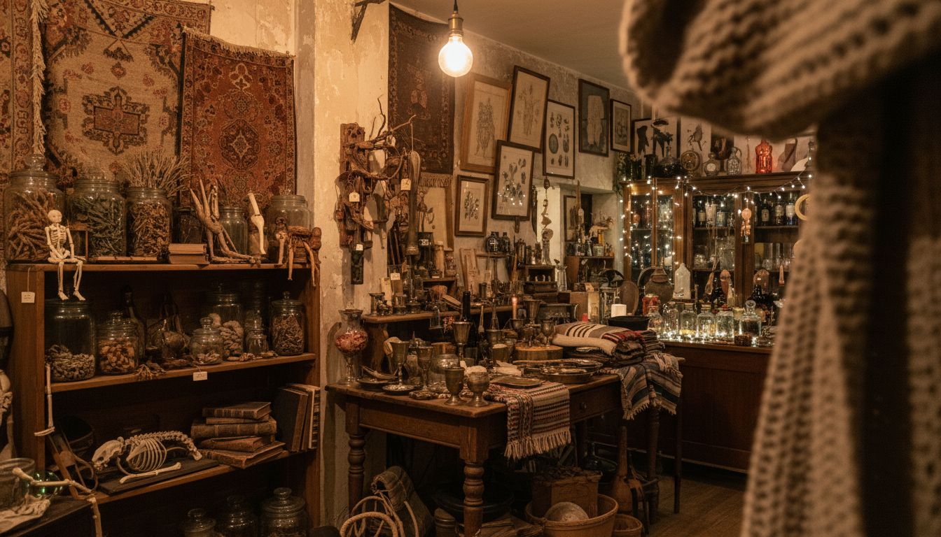
Modern retail design has gone minimalist to the point of sterility. Modular shelving. Neutral tones. Visual silence. All very chic, until your customer leaves without buying anything except a flat white from across the road. We’ve smooth-coated ourselves into oblivion. But not everyone’s buying in. A tiny brand called Rusk & Fig just launched its new flagship with what they’re calling Reverse Visual Organisation. Translation: chaos on purpose. Artifacts on every surface, floor-to-ceiling jars of mysterious things, uneven lighting. It’s a deliberate mess. And it's working.
Designers used to edit. Now, they curate. The difference? Editing cuts down. Curating layers meaning. Rusk & Fig didn’t stumble into Ugly Chic. Their creative director used to catalogue ecclesiastical garments, for crying out loud. Every tapestry hanging in the store is linked to a product, even if you don’t realise it. You feel it. You catch it in your peripheral vision like a memory you didn’t know you had.
Advertising loves novelty, but design is often at its best when it lets us wander a bit. Get lost. Sure, the algorithm wants singular focus. But humans—especially New Zealanders—like a bit of rummaging. We want the spontaneous association our newsfeeds can’t offer. So next time your client says "clean and simple," maybe ask which century they’re designing for. The 2020s ended six years ago. Clutter is back. Hide something on the shelf. Someone will find it.