Why Are Ice Cream Vans So Bad at Branding?
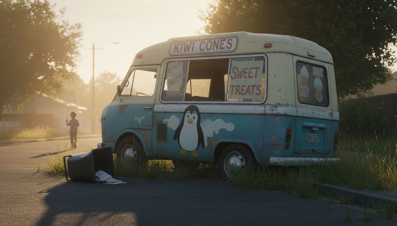
The other day, on a dead-end street in Northcote, I watched a melted-looking van lurch past like it had just survived a minor flood. On the side, in cracked Comic Sans paint, a vaguely deranged penguin held out a cone. Not a trace of a logo. No clear name. Just a phone number that looked like it predated the internet. This is the iceberg tip of a long-frozen problem: ice cream vans are catastrophically underbranded.
Here’s the strange bit: they’re in one of the most memory-rich territories you could imagine. Sound, place, taste, summer. Ice cream vans hit every sensor you’ve got, then proceed to waste all that multisensory equity with graphics that look like a 2003 ClipArt CD-ROM. Why? Cost isn’t the answer. Plenty of scrappy pop-up coffee trucks get it right. They build a cult identity from a few stickers and a decal. Ice cream vans, meanwhile, cling to some post-war nostalgia that never existed. We romanticise them because of what they sell, not because of how they look.
There’s a syndrome I’ve noticed in legacy food-on-wheels: the myth that being shabby makes you authentic. But authenticity doesn’t mean neglect. You can have patina without parody. Good brands – mobile or not – learn how to repeat, reinforce, and reinterpret their look over time. Not once, driving behind Drippy's Treats (yes, real name), did I feel like I was gaining familiarity. It was just a weird white box with lurid airbrushing. It could have been selling meth. Or mattresses.
Designing better for this tiny sector means treating it seriously. Vans with character, yes, but also with consistency. Taglines that stick. Trade dress that doesn’t peel off in the rain. Maybe a visual identity where the penguin isn’t doing 16 things at once. There’s something oddly exciting about fixing a space no one thinks about. It’s branding in the wild. Go deep into the freezer.