Why Every Brand Wants to Be a Cereal Box Now
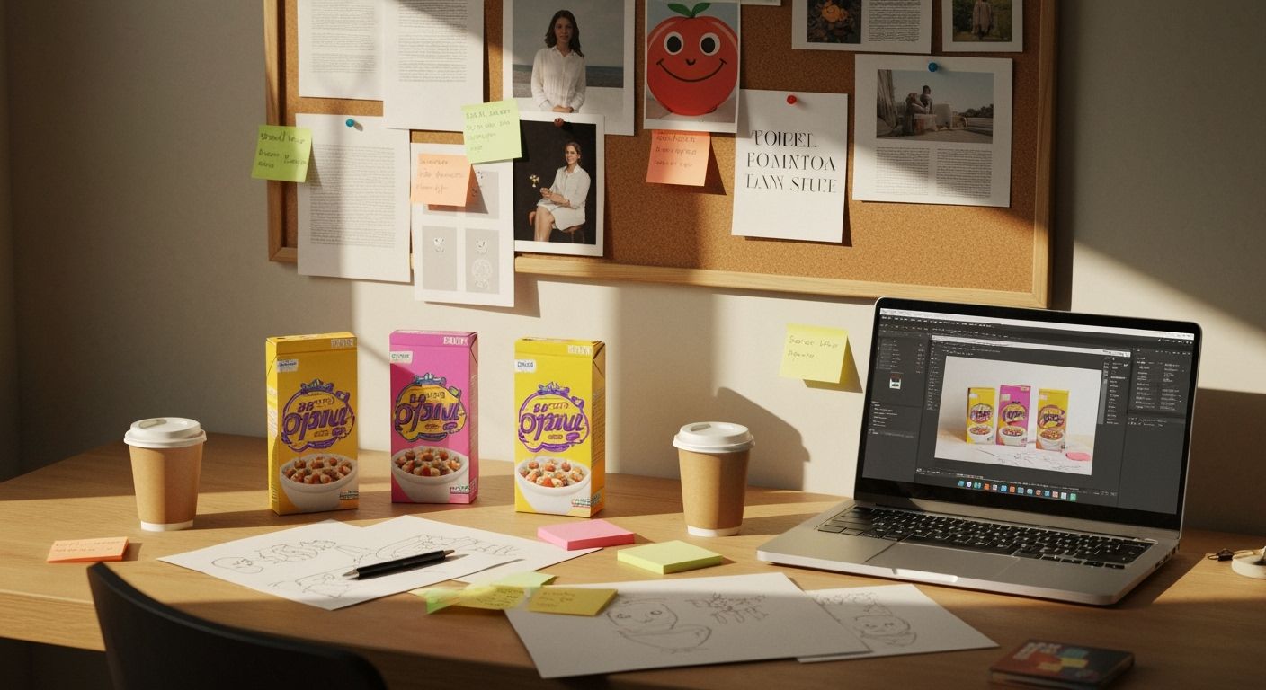
Something strange is happening in packaging design. Scroll past any trending product on Instagram, and chances are it now looks suspiciously like breakfast cereal for design-forward adults. Soft blocks of pastel, chunky lettering, illustrations that feel like doodles you’d draw waiting at the dentist. It’s chaos, but curated chaos—the kind that screams, “We’re fun, but we’re premium, but don’t take us too seriously.”
You’ve seen it with oat milk. You’ve seen it with sparkling water. Now protein bars, vitamin gummies, and even finance apps are dressing up in the same Technicolor cheer. What’s going on? Deep in this rabbit hole I found a theory: this is marketing’s response to melancholy. Call it the Great Softening. After a few years of hard news, hard edges, and hard times, brands are wrapping themselves in Gen Z baby blankets. Bold copy in lowercase, cartoon croissants, smiley faces with no noses. It’s the visual language of emotional safety.
But the real kicker is how specific this look is. Not just playful, but curated to look like a design student made it in Figma at 2am. The art direction says, “We don’t hire agencies.” Except, they absolutely do. This is the new visual eliteism. To look casual, you now need a 12-slide internal brand deck and a Slack channel called something like #vibe-check.
This isn’t a criticism. It’s working. These brands leap off shelves and screens because they’ve figured out how to perform authenticity without sacrificing polish. For marketers and designers in New Zealand, it's a cheeky reminder. You don’t need to be loud, or even traditionally clever. You just need to make people feel like they’re in on the joke—and be very, very good at pretending you didn’t try so hard.