Why Are Iconic Logos Suddenly So... Shy?
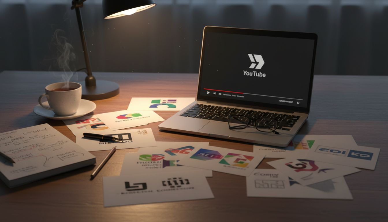
Have you noticed it too? The bigger the brand, the smaller their logo. Look around. Netflix now whispers its 'N' in the corner. Apple barely bothers. Even local brands that once roared now mumble timidly in 9-point Helvetica. You’d think we’re in a logo recession.
So what’s going on? This isn’t humility. It’s strategy. Brands are betting on cultural presence over literal presence. They want us to feel them without seeing them. It’s the smell of McDonald’s fries in an airport, not the arches. It’s the Bunnings jingle playing faintly from a tradesman’s phone. Ubiquity, without formality.
But there’s a risk. Branding used to be the suit you wore to be taken seriously. Shrink the logo too much and suddenly, you’re just a vibe hoping to be recognised at the party. This demands a level of confidence that borders on arrogance. To pull it off, every other touchpoint — sound, colour, motion — has to demand attention, subtly. No weak links allowed.
Stripped logos are not lazy. They are the result of surgical restraint and terrifying precision. They’re trusting the brand to do the work, not the badge. And for marketers, it’s a challenge worth taking on. Can your brand survive without saying its name out loud? If you can pull that off in Invercargill on a rainy Tuesday — now we’re talking power.