When Did the UX of Streaming Become So Hostile?
Somewhere between binge fatigue and autoplay tyranny, streaming platforms declared war on their own users. It’s subtle at first—just a hovering preview you didn’t ask for, a nudging carousel of content you’ll never watch, or a new UI update that hides your watchlist four taps deep. But it's not a glitch. It's a design decision. And it's making us all a little bit angrier.
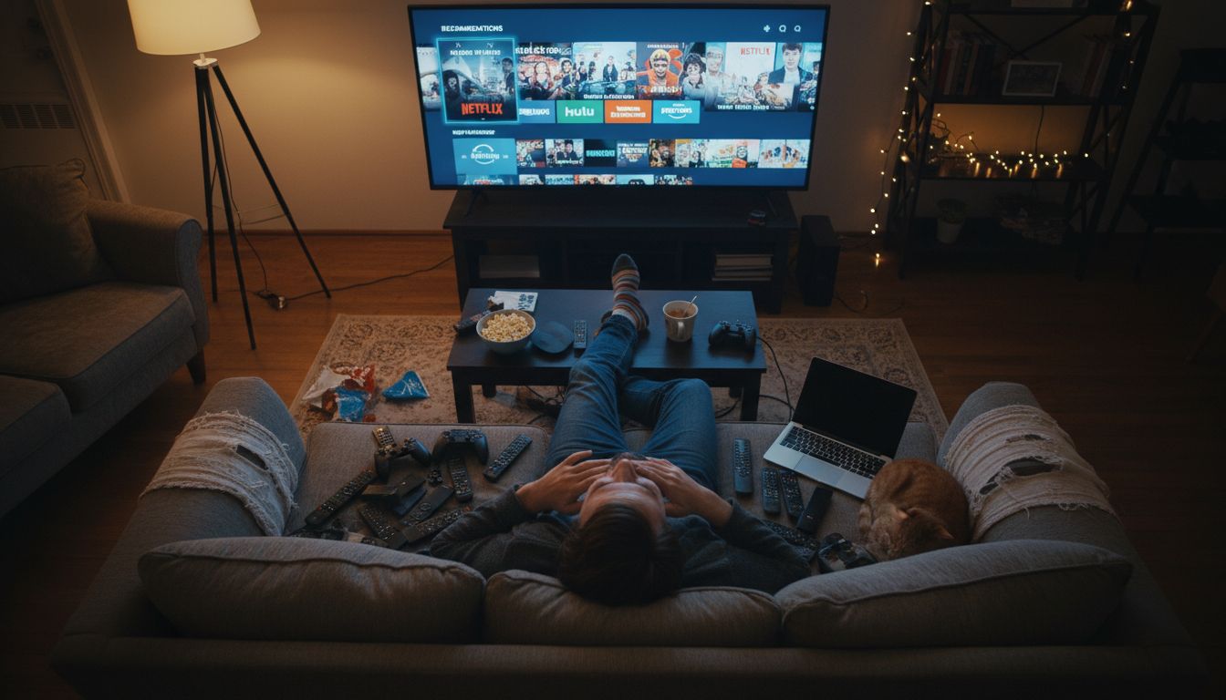
I started noticing it earlier this year when my partner, a notoriously passive tech user, hurled the remote across the couch after being asked—again—if she wanted to upgrade to "Super Premium" access for early episodes. She wasn’t even done with Season 2. Something has changed. Navigation is slower. Interfaces are louder. They beg for interactions when really, I just want to watch a half-hour food doco without being harassed about the next Marvel spinoff.
Here’s the strange part. The design teams behind these platforms are the best-paid, most scrutinised squads in tech. They A/B test everything. They know where your eyeballs go before you do. Which means all these choices—the clutter, the pop-ups, the aggressive upselling—are deliberate. Streaming UX used to be built on trust: if we made content easy to access, people would stay. Now, it's built on interruption.
And we let it happen. Netflix trained us to expect autoplay. Disney+ trained us to expect spinoffs. Now every interface assumes we’re children who need help deciding between a Thai horror short and another round of The Office. I’m not nostalgic for 2014, but I do miss feeling like the platform was working for me, not against my attention span. Maybe in 2025, good design isn’t quiet anymore. It’s needy. And it’s loud.