Why Restroom Signs Might Be the Boldest UX Move of the Decade
Let’s talk about the toilet.
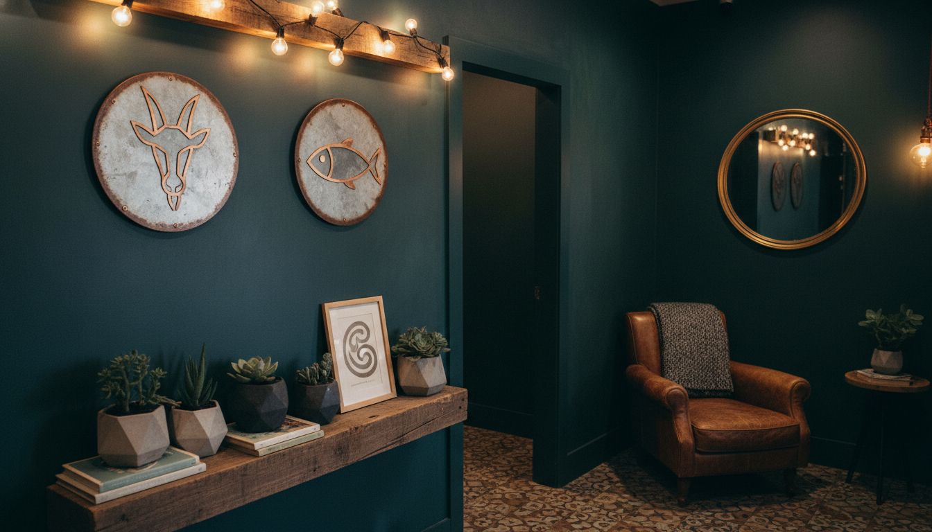
Not hygiene. Not plumbing. The signs. The icons. The decisions behind them. Wander into any boutique café in Auckland or a co-working space filled with UX designers and fermented beverages, and you’ll find restroom signage that's either wildly ambiguous or trying so hard to be ironic it becomes a minor escape room challenge. Cow, rooster, triangle, circle. Pablo and Frida. Sometimes just a gradient.
This isn’t just hipster decoration. It’s branding with stakes. If a user has to pause, squint, or politely ask a stranger, your design has already failed. The average person navigates a new café like they're cracking a safe. The restroom icon, ideally, should be invisible—in the good way. A perfect cue, absorbed without effort. But now, these signs are being treated like easter eggs, little riddles designed to showcase the venue’s quirkiness at the expense of clarity. If you ask me, this has become the most visceral test of UX design out in the wild—that brief, bladder-fuelled moment of navigation.
Here’s the delicious irony. While tech companies run thousand-user tests and battle over button radius, someone printing a pixelated goat for a women’s restroom is out here making a louder brand statement than any homepage hero image ever could. In a way, restroom signs are one of the last true street-level UX experiments that reach beyond screens. They’re weird, they’re brave, and whether we agree with them or not, they reflect how design seeps into the most mundane, necessary places. Bet you’ll notice them now.
So next time you use a bathroom in a place that sells single-origin espresso and oat milk ice cubes, look up. Someone chose that icon. Someone went to war in a Slack thread over that goat.