Why Every Energy Drink Tastes Like a Colour and What That Means for Branding
Grab a cold can of liquid anxiety and try not to think of the name. Was it VenomRush? TurboClaw? GlacierBlast? Doesn’t matter. What you remember is the colour. Blue—and you know exactly how it tastes.
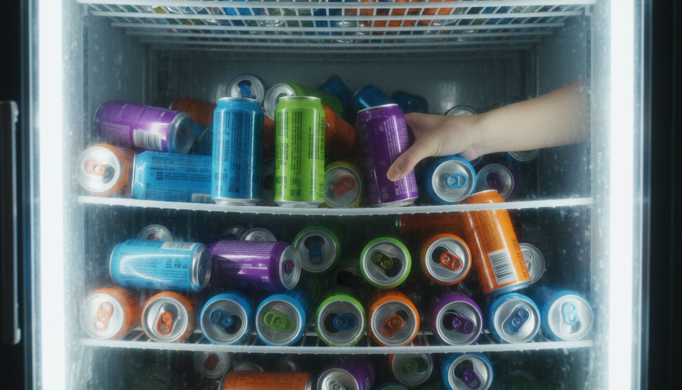
Energy drink marketing is a masterclass in sensory substitution. Everyone's selling taste, but very few are offering flavour. What they offer instead is sensation. Brands like Monster and Rockstar have spent fortunes reverse-engineering the feeling of 'purple lightning' or 'green thunder', whatever that means. It’s a full-body excuse to pump sugar into your neurons, but the real trick? They're selling you a mood masquerading as a colour.
It works. From the claw-marked cans to the synthetic tang of 'neon mango', the entire category has bulldozed its way into the culture by rejecting good taste in favour of full-saturation identity. This isn’t about subtle flavour notes. This is about purple meaning rebellious and orange meaning chaotic late-night coding blitz. Design here is kinetic, not contemplative. It doesn’t whisper, it blasts.
What can marketers learn from this hyperactive circus? Build faster archetypes. Don’t fanny about with brand pyramids when your audience gets it in two seconds. Energy drink companies understood something snobby designers miss. People don't always want authenticity. Sometimes they want fantasy in a 330ml hit. And if you can make it taste like blue, even better.