Why Half of Christchurch is Wearing the Same Colour Palette (and What That Tells Us About Marketing)
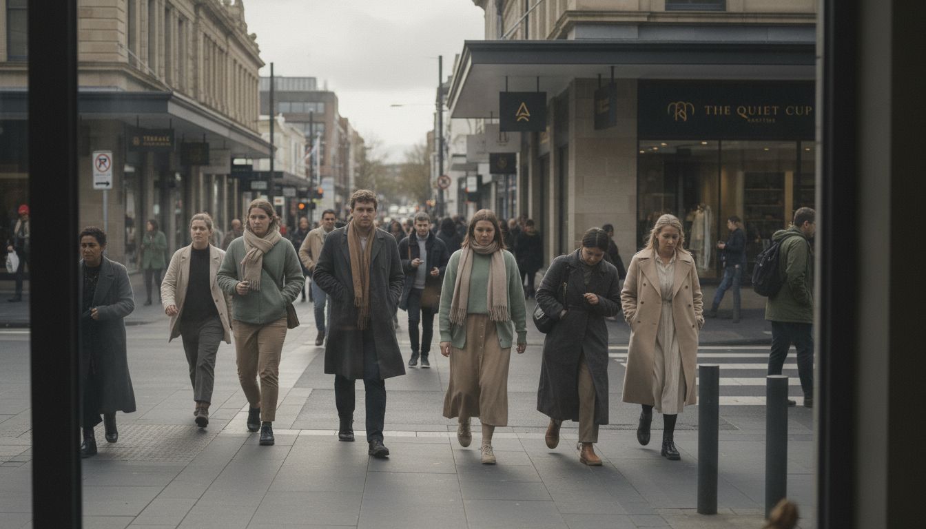
Spend 20 minutes in central Christchurch and you’ll see it. It’s everywhere. The soft sage. The wet concrete grey. That weirdly specific tannin beige. It’s as though someone’s set a national dress code and no one told me.
It turns out it's not just happenstance. I’ve spent the last fortnight chasing down colour trend reports, flooring supplier catalogues, and chatting with textile reps who use words like “ochre” unironically. What I found? A quiet, sweeping marketing movement that’s happening at the level of pigment. It’s not driven by brands, but by interior design influencers, bespoke paint companies, and ASMR YouTube channels that feature slow, satisfying home renovations.
These aesthetic movements often begin far from the world of advertising. They’re coded in Instagram stories, wallpaper samples, and cinemagraphs of coffee tables. But slowly, marketers take note. They start aligning their campaigns with the prevailing aesthetic mood. That’s why every ad for a CrossFit gym now has diffused light and linen curtains. It’s also why your bank app suddenly feels strangely *warm*. Micro-trends in domestic style bleed into how we market everything from water filters to wellness retreats.
Maybe we’re just craving calm in a chaotic world. Or maybe we’ve all just subconsciously agreed that rust is the new red. Either way, if you’re building a brand in New Zealand right now—especially one targeting the millennial and Gen Z orbits—ignore moodboards at your peril. A bad colour read isn’t just dated, it’s culturally misaligned. And that's a bigger problem than picking the wrong logo.