Why Every Brand Should Rethink the Sound of Loading
There’s a moment you probably haven’t thought about since the early days of Wi-Fi buffering nightmares: the sound of waiting. Not the silence, but the tiny, neglected audio moments brands sprinkle into digital products. The clicks, swooshes, thuds and yes, the dreaded loading spin. We talk endlessly about usability and visual identity, yet the sonic layer gets shoved to the back like a sad ukulele in a crowded guitar shop.
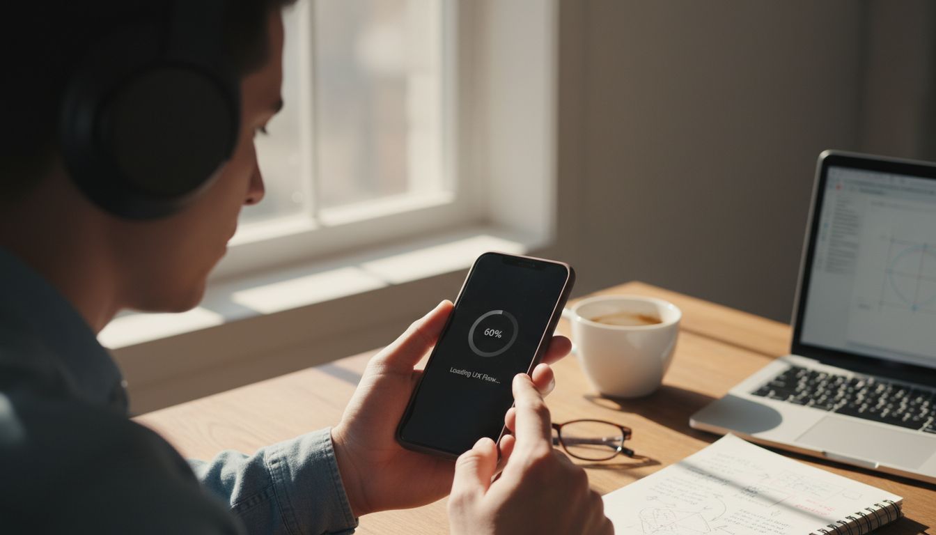
Lately, I’ve been obsessed with app openers. I’ve been opening apps slowly, deliberately, sound on, just to catch how different companies treat the milliseconds before they demand your attention. Some have a crisp blip, others a velvety woosh. Most? Dead air. It’s like receiving a beautiful gift box, only to find it empty inside. When done well, a sound design cue can be a brand signature. Netflix’s iconic “ta-dum” didn’t happen by accident. It was tested, refined, and timed to create anticipation. Why aren't more local brands crafting their own?
And this isn’t about adding noise for noise’s sake. It’s about tone, timing, and how a micro-second sound can make a product feel expensive or clunky. Imagine if the IRD login app (which yes, exists) had a reassuring hum or even a soft ‘ding’ to say “Don’t worry, you’re in.” It’s design not as garnish, but as a main ingredient. Something that makes people feel something beyond frustration.
We’ve spent decades perfecting CTAs and colour schemes. Maybe this year, it’s worth asking: what does your brand sound like when it’s not speaking? If you’re in charge of anything digital and client-facing, go on. Turn the volume up. If it’s silent, that might be the loudest problem you’re not hearing.