The Geometry of the High Street Pharmacist

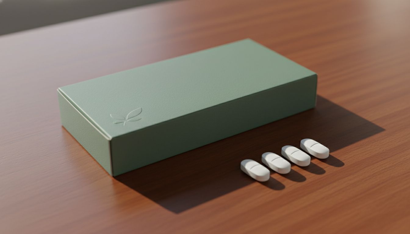
Walk into any local chemist in 2026 and you will notice a quiet revolution in green. I am not talking about the cross outside, but the specific shade of mint used on private label indigestion tablets. For three months, I have been tracking the shift from clinical white to this particular, calming seafoam. It is a masterstroke of psychological reassurance. These brands have realized that we do not want a lab coat anymore. We want a spa day for our heartburn. The packaging designers have ditched the aggressive red arrows and bold warnings for soft-touch matte finishes that feel expensive in your hand.
I spent Tuesday afternoon comparing the pill shapes of three different generic brands. One has moved to a pebble-like curvature that mimics the smooth stones you find on a West Coast beach. It is tactile, almost comforting to hold before you even swallow the thing. This is the peak of functional intimacy. The design teams are obsessing over the haptic feedback of a blister pack pop. The sound is deeper now, less like a tinny snap and more like a muted, satisfying thud. It suggests quality and stability in an age where everything else feels like flimsy plastic.
This shift represents a broader movement in New Zealand retail. We are seeing a rejection of the loud and the urgent. The modern consumer is exhausted by visual noise, so the brands that win are the ones that lower their voice. By focusing on the radius of a corner or the specific weight of a cardboard box, these designers are creating a sanctuary on the shelf. It is a tiny, perfect piece of industrial art that you buy for six dollars. It makes the mundane task of self-care feel like a deliberate, aesthetic choice rather than a chore.