The Humble Art of the Local Vet Clinic Postcard
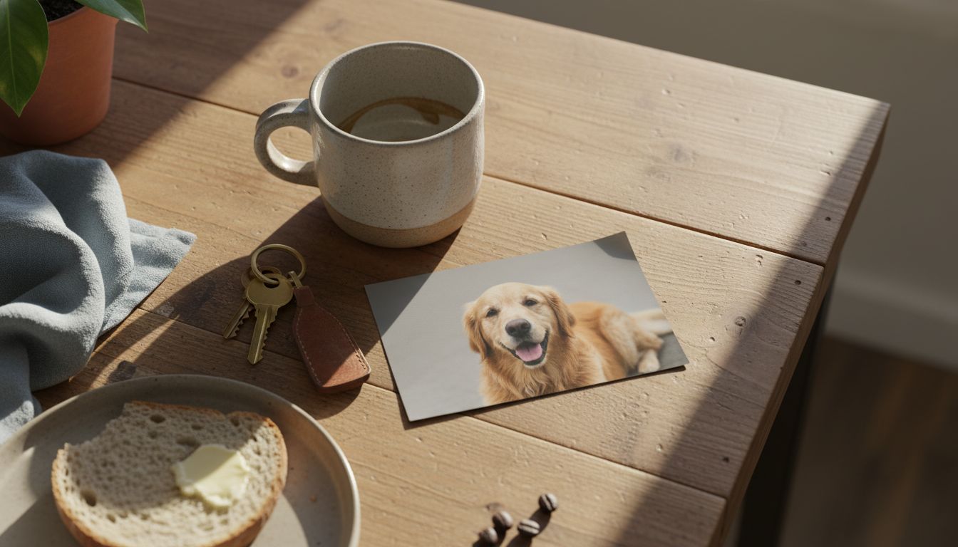
I spent four hours yesterday analyzing a series of appointment reminders from a small clinic in Ponsonby. It is 2026, and yet the most effective marketing engine in the country is a piece of 300gsm cardstock with a slightly blurry photo of a Golden Retriever. There is something profoundly tactile and honest about a physical reminder that does not ping, vibrate, or sell your data to a third-party aggregator. These cards bypass the digital noise of our augmented reality glasses and sit comfortably on a kitchen bench, demanding nothing but a five-minute phone call.
What fascinated me was the specific choice of blue used for the logo. It is a shade that screams reliability without the coldness of a corporate bank. I tracked down the printer who handles these small runs. They told me the clinic owner insists on a matte finish because it feels more human. In an era where every brand is trying to optimize their conversion funnel through biometric tracking, this vet is winning by understanding the psychology of the fridge magnet. It is high-touch in a high-tech world, and it works because it respects the domestic ritual.
We often overlook these micro-moments of design. We focus on the global campaigns while the neighborhood vet is building a multi-decade legacy through consistent, physical touchpoints. There is no algorithm for the warmth of a handwritten note on the back of a postcard. This is the ultimate design flex. It is a refusal to be ignored by being too quiet to dismiss. I am now convinced that the future of premium branding isn't found in a headset, it is found in the letterbox.