Why the Best Brand Moves in 2026 Look Suspiciously Like Bad Decisions
Let’s talk about intentional ugliness. Not ironic, not cool, not Balenciaga-level curated chaos—just plain strange, jarring, what-were-they-thinking kind of work. Because lately, brands doing the visually unexpected are not just ahead, they’re stealing the entire race.
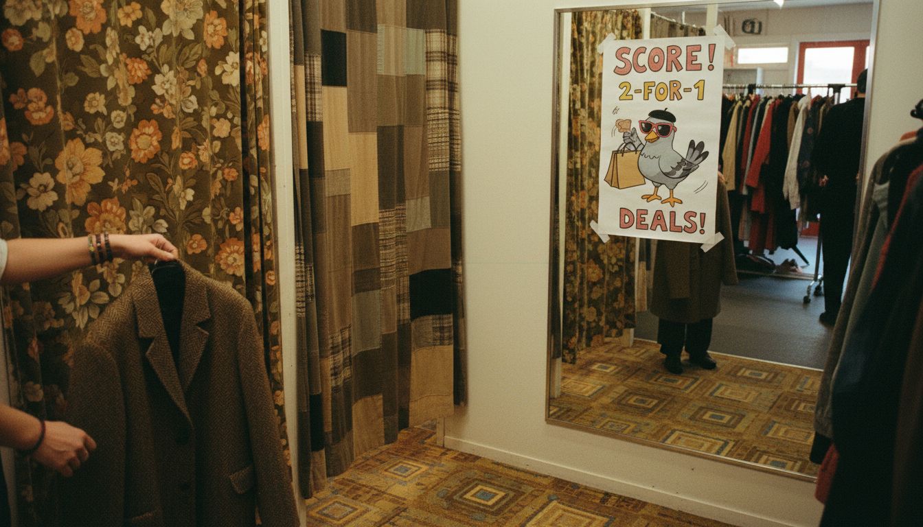
Take a recent campaign by a Kiwi chocolate brand that plastered pigeon-themed mini ads across op shop changing rooms. No logo, no tagline, just a QR code and a badly-drawn pigeon eating caramel. The reactions? Confusion, selfies, and a spike in online sales the company will only admit to if cornered. Because breaking pattern recognition isn’t bad branding anymore, it’s the whole strategy. It’s not meant to be understood, not fully. It’s meant to feel like stumbling upon a secret.
This isn't some Gen Z ploy or performance art stunt. It's a calculated rejection of polish, and brands that commit to it know they're not trying to catch every eye. Just the right weird ones. I spent twenty minutes on the website of a Hamilton-based ceramics collective because their homepage looked like it was designed using a hoverboard—chaotic, twitchy and oddly entrancing. It made me curious. And curiosity, not clarity, is driving the best marketing right now.
The real lesson? A suspiciously sloppy idea isn’t necessarily a bad one anymore. It might be your new best bet. Confusion is sticky. Perfection is skippable. Leaning into a bit of visual chaos, a plot with missing pieces, even mild discomfort—it all adds up to cultural gravity. And gravity, as it turns out, sells chocolate.