Tattoo Flash Sheets Are Teaching Us More About Branding Than Most Agencies
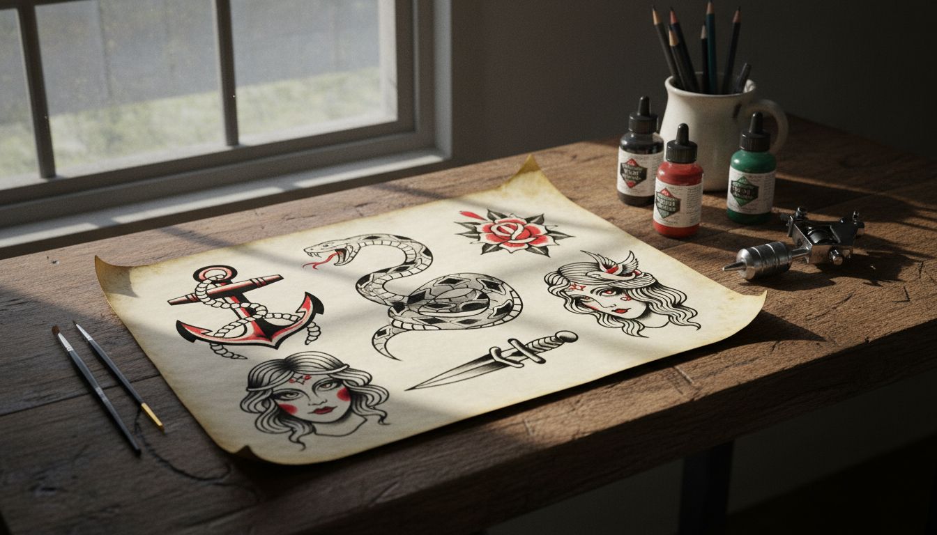
A few months ago, I got stuck in a rabbit hole of 1980s sailor tattoo flash. Not because I wanted a dagger through a heart (though, tempting), but because I started noticing how these designs communicated entire identities with zero fluff. One sheet, twenty hand-drawn images, and suddenly you’ve got a whole ethos. Drunk in a Honolulu alley? Here’s a hula girl. Seen some things in the Navy? Here's an anchor on fire.
It hit me: this is branding in its purest form. Not the rebrands with a pink swish and a TikTok filter. Real, raw symbols that say exactly who you are and where you’ve been, in five squiggly lines or less. And unlike corporate identities that need press releases and launch events, these lived on forearms, thighs and sometimes necks, doing their job with brutal clarity.
So I started comparing modern branding briefs to tattoo sheets, and honestly, the flash holds up. Iconic marks. Unapologetic tone. A strong sense of story. Why aren't more brands thinking like old-school tattooists? You want a loyal fanbase? Try designing something they’d actually get inked. Logos should dare to be worn, not just resized.
This shouldn’t be treated as irony or nostalgia. It’s a lesson. If your brand can make someone feel something in five seconds, you've got a fighting shot. Yet too often we see brands sidestep sharp edges in favour of 'playful universality' or whatever the deck says. The lesson from the flash sheets? Be literal, be local, be loud. The rest is background noise.