When the Warning Labels Got Good: How Packaging Design Learned to Whisper Better
There’s a cheeky little design war brewing in the corner of your kitchen pantry, and you probably missed it. A quiet uprising of thoughtful packaging that *doesn't* scream for attention but instead gently asks if you'd like to know more. Not the loud, red SALE-flashed cereal boxes, but the quietly brilliant rise of mature, whispering design. I’m talking about warning labels.
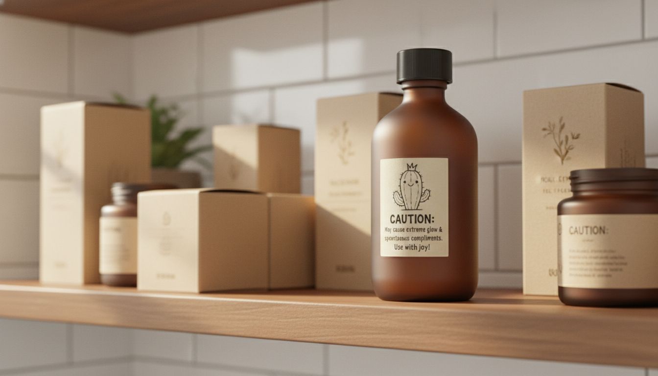
Yes, warning labels. The bit no one actually reads. Or didn’t. Somewhere around late 2024, someone—somewhere—started designing product warnings like tiny minimalist haikus. Now, in 2026, I find myself flipping bottles just to find the back label.
It started with natural cosmetics. “Avoid contact with eyes” became “Not for peepers” on one brand. Then another went full-literary: “Our lavender blend is chill, but not for the iris.” What’s powerful here is restraint. These aren’t viral stunts or snarky marketing. They are whispers. Precise, lightly human mischief embedded in what used to be legal-speak. And you remember them. It’s anti-attention marketing done right.
It takes guts to let design be this still. It means trusting your audience to lean in, not look away. And it works, because it feels like a private joke. Every other brand is still shouting. But the smart ones, the clever birds in this new flock, have learned that sometimes the most powerful message is the quietest one on the pack.