Why Does Every Coffee Bag Look Like Yoga Pants Now?
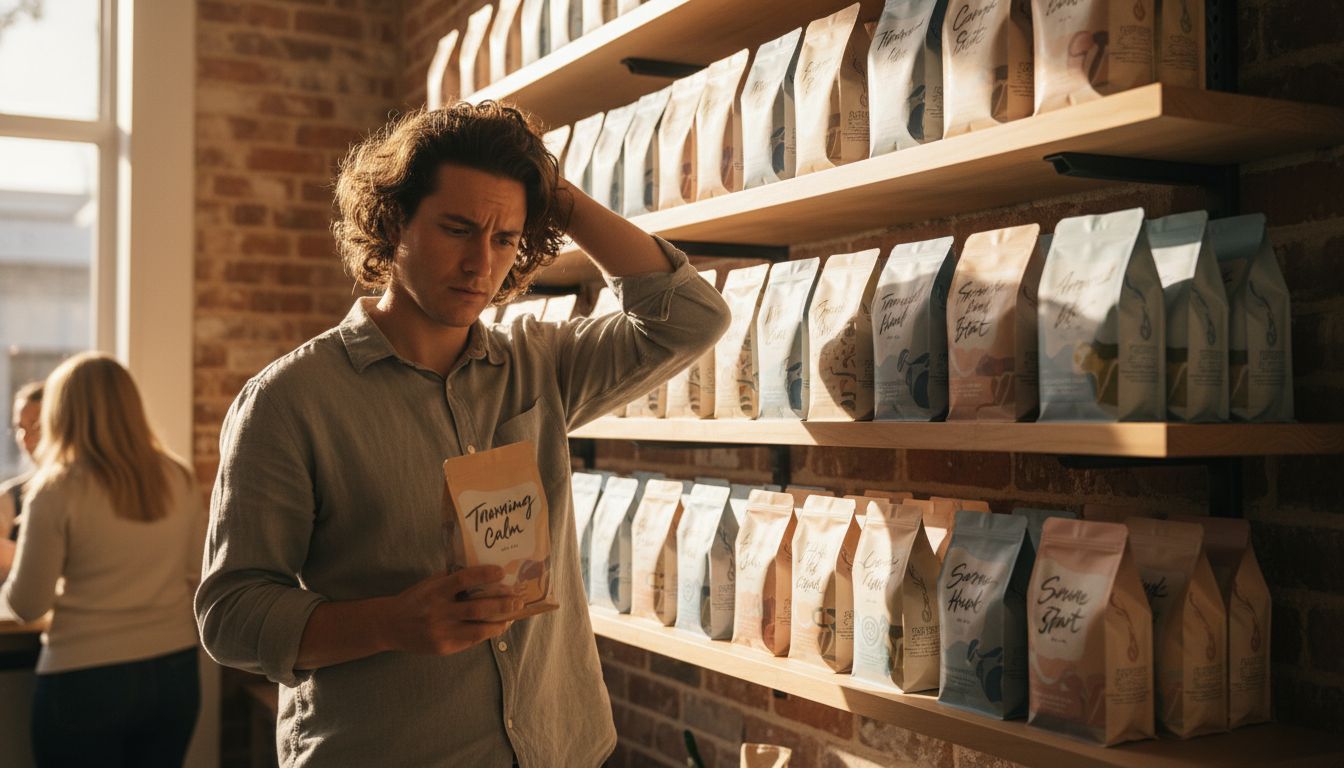
I spent 40 minutes in Flax & Feathers last weekend trying to buy a bag of coffee and left with existential dread and a lavender exfoliant I didn’t ask for. Why? Because our once-humble coffee branding has gone full wellness influencer.
Somewhere between the charcoal-sketched Colombian co-op logos of old and the brutalist sans-serif bags of the 2010s, we fell into the era of oat-toned gradients and words like "soulful" printed in lower-case cursive. Coffee now looks less like caffeine and more like mindfulness. The retail shelf is a pastel pilgrimage. Even compostable packaging has been curated to look like an Instagrammable lifestyle flat-lay. Where did the roast date go? Why is this bag telling me to 'breathe deeply'?
Here's where things get dangerously close to parody: one Auckland-based brand has swapped tasting notes for mood descriptors. Think: 'Grounded, With a Hint of Horizon'. It's coffee, not a guided meditation. Not to say design can't evolve (it must), but we’ve traded substance for style so hard it’s become hard to tell if we’re buying beans or a self-care movement in a pouch.
I’m all for beautiful design. But when every bag looks like a yoga mat, the real identity—origin, roast, flavour—gets brewed out. Our eyes have taken over from our taste buds. Maybe it’s time we demand a little grit back in our grind.