Axes, Aprons, and the Rebrand of Rural Cool
I spent last Saturday at the Kauri Coast Woodchop Invitational, and somewhere between the underarm and the standing block I realised rural event branding is having a moment. Not a polite refresh. A full strut. The organising committee, now calling itself North Timber Collective, has turned what used to be a few trestle tables and a chilly bin into a masterclass in identity.
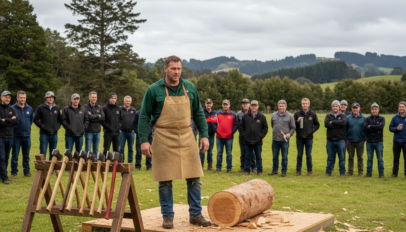
Start with the uniforms. Not costumes. Uniforms. Deep forest green drill shirts, stitched with a tidy circular crest featuring crossed axes and a native fern frond. The competitors look like elite athletes, not blokes who wandered over from fencing the back paddock. Even the aprons have been considered, heavy canvas in sand tones, waxed just enough to catch the light. It signals craft. Heritage. Pride. You can feel the shift in posture. When people look the part, they behave like the future of a sport.
Then there is the staging. Hay bales are out. In their place, clean timber platforms built from locally milled macrocarpa, stacked with the kind of precision that makes you want to run your hand along the grain. The trophy table is a sculptural slab, still rough on the edges, polished only where the cups sit. It tells a story without spelling it out. This is not nostalgia. This is confidence. The message is clear, woodchopping is not a relic, it is theatre.
And here is the interesting bit for marketers. No glossy campaign. No celebrity cameo. Just obsessive attention to the physical world. Materials. Colour. The way the axes are racked in perfect symmetry before each heat. It feels deliberate, almost reverent. In 2026, when every second event is chasing spectacle, there is something magnetic about a rural sport that simply decides to present itself properly. Turns out rebranding does not always mean louder. Sometimes it means sanding the edges, oiling the surface, and letting the craft speak with its chest out.