This Ad Was a Napkin Drawing. It Might Be Brilliant.
There’s something brazen about advertising ideas that look wildly undercooked. A blurred photo, a weird felt-tip drawing, maybe even a scrawl on the back of a takeaway receipt. Lately, this kind of lo-fi creative has been showing up in proper campaigns. Not as a placeholder. As the final execution. And it’s working.
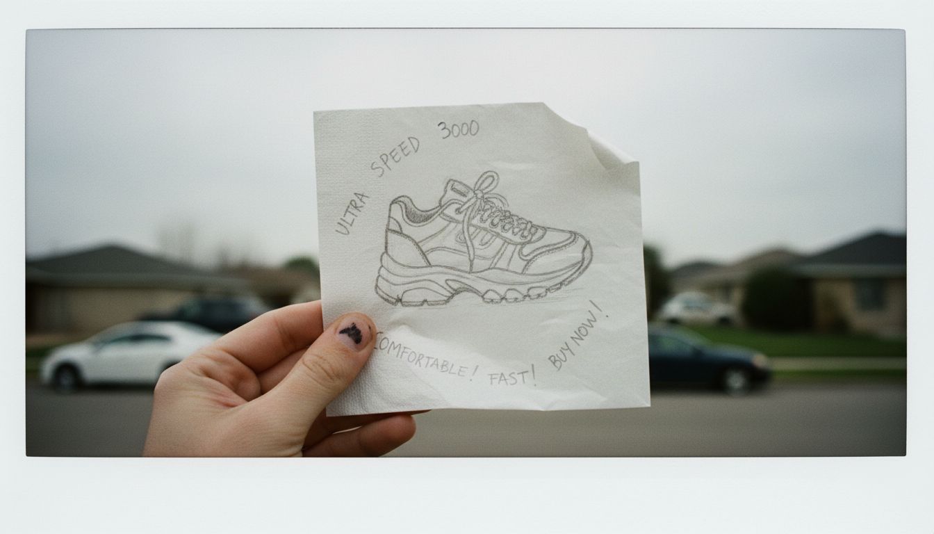
Take the recent campaign from Pinegrit Shoes. The entire launch was built around scribbled diagrams and semi-legible notes. One ad featured a child's drawing of a foot with the cryptic caption, "This is it." That’s it. Oddly enough, it spread. Fast. The lo-fi aesthetic is no longer a cheeky moodboard; it’s the main meal. But here's what's key: the shabbiness is strategic. It's radical sincerity dressed in mess. You can’t fake randomness well without a serious amount of intent.
I dug into this, hard. Turns out the creative team behind it spent weeks trying to make things look ‘accidentally good’. Pages and pages of almost-art, rejected because they looked too designed. Apparently the napkin campaign was version #46. Precision requires patience, but roughness demands restraint. It's like jazz, where one wrong note is brilliant only if you know why it’s wrong.
This isn’t about being scrappy for attention. It’s about trust. When a brand puts out something verging on chaotic, it signals confidence. It whispers that they don’t need to scream. They’ll let the audience lean in. And in a market draped in polish, that rawness feels like truth. Or at least a wink at it.