Why the Best Packaging Design in 2026 Lives in a Pet Food Aisle in Invercargill
Let me say this plainly: I have never bought dog food in my life. I do not own a dog, never have, likely never will. But two weeks ago, I spent forty minutes loitering in the pet food aisle at a PakMart in Invercargill, staring at a shelf of wet food tins designed so beautifully I forgot where I was. And I’ve thought about them every day since.
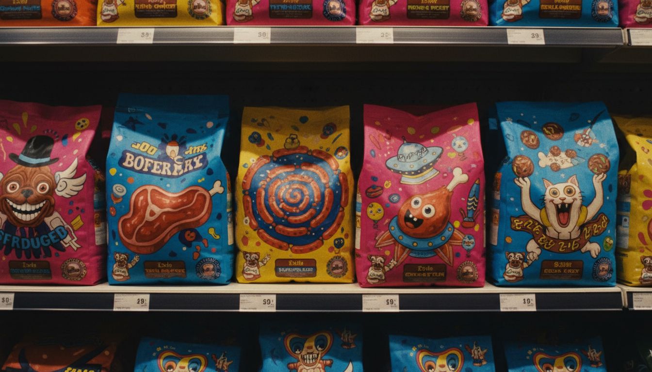
This wasn’t nostalgia design. There were no fake craft-paper textures or off-whites pretending to be sustainable. It was a riot of saturated tomato red, absurd close-ups of glistening beef, and a logo so confidently odd it felt like an inside joke between art directors. The brand was Snörfl—a name that reads like an accident and sounds like a sneeze—but on the shelf, it owned the chaos. Legibility? Minimal. Memorability? Maximum. In short, it was ridiculous. And it worked.
We’re in a visual era of semi-deliberate dysfunction. Serious brands are embracing awkward design, trusting that enough friction grabs us. That Snörfl tin didn’t flatter the consumer. It just dared them to dismiss it. The tin told you, plainly, ‘you’re not the main character here. The dog is.’ That choice is oddly liberating in a sea of brands desperate to be palatable. It’s not ‘bad’ design, it’s fearless design.
So why is some of the freshest, smartest visual storytelling sitting beside chicken-and-brown-rice medallions for Labradors? Because boundary-pushing design thrives in overlooked places. All the ego is tied up in skincare pumps and minimalist shampoo bars. Down here, in the shelves we breeze past, someone is having real fun. And they might be redefining packaging for the rest of us. Call it what you want. I call it sublime beef overkill, and I want more.